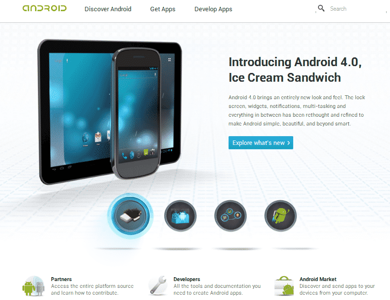
Google has finally changed the look of Android.com. The earlier look of the site was very low on usability and fraught with technical terms. With the new look, it’s much easier to browse through the site and look up latest releases in the world of Android.
For long, users had complained that Android.com was a sight which suited only developers and the likes and not an average user. It looked what many call ‘dry’ and an average user had a lot of problem digging out content of his/her interest.
Apparently, that was the intent with which Google had launched the site – for releasing official statements and facilitating the Android develop community.
However, Google has finally revamped the entire site. Here are some key features of the new look of Android.com:
The new look:
The best thing about this new look is that if you are an average user, curious about Android and the latest developments regarding it, you can know it very easily. A lot white space gives the site a very neat look and the fairly colorful fonts play well on the eyes. The ‘Get Apps’ page very clearly details out the Android Apps. These apps are bundled together in themes so you can immediately get to what you are looking for.
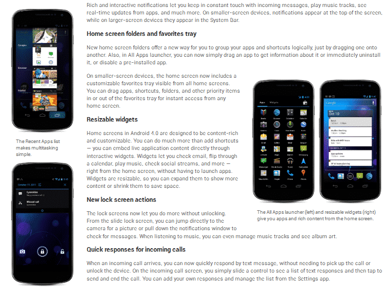
The home page displays the major recent development in the Android world, Android 4.0. And as soon as you click it, you are taken to a page where you are given a detailed narrative about all the cool features of this new OS.
Overall, the website just went from dull to exciting. And browsing through it is quite some fun.


