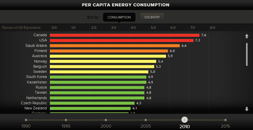
With the available biofuel resources depleting fast on our planet, the world is beginning to warm up to the notion of energy efficiency. This has led to tapping alternate energy sources, reduced reliance on biofeuls and a number of new measures. Below is an infographic which shows how the per capita consumption has changed over the years.
Whereas the infographic provides a timeline of per capita energy consumption by country ever since 1990 to 2015 (projected forecasts), it is interesting to note that the most dramatic changes have occurred after 2000.
In the last decade or so, the landscape of energy consumption has shifted significantly. However, one thing that has remained constant over the years is that the U.S. and Canada have topped the list of per capita consumption.
Canada, specifically, has registered the highest global rates of per capita energy consumption. Most European countries, on the other hand, lie further down the list though, surprisingly, Scandinavian nations making it among the top ten.
Even more interestingly, Saudi Arabia has fast risen to the top of the list over the year and by the year 2015, it is being forecast that KSA will have the highest per capita energy consumption rates. This must be seen in context of the fact that KSA’s oil reserves are expected to last a few more decades after which the country will inadvertently have to look to alternatives, something it isn’t currently focused.
Although Canada and U.S. currently top the list, the duo has trimmed down their per capita energy consumption by a small portion which is commendable indeed.
Source: Energy Realities
[ttjad keyword=”best-selling-gadget”]


![Read more about the article When Fiction Meets Reality – A Timeline [Infographic]](https://thetechjournal.com/wp-content/uploads/2012/04/1333999604-the-fiction-to-reality-timeline-1-512x324.jpg)
![Read more about the article UFC Fight Of The Century And Its Relevance To Social Media [Infographic]](https://thetechjournal.com/wp-content/uploads/2012/04/ufc-512x277.png)
![Read more about the article A Look At London Olympics 2012 [Infographic]](https://thetechjournal.com/wp-content/uploads/2012/07/olymp-512x269.jpg)