Many of us have seen that pestering navigation bar that sits atop the Google home page and is fraught with the endless services Google offers. Granted, Google’s home page has always remained super-clean but that bar seems at odds with it. Now, Google may be planning to change this by introducing a tiny grid in its place, taking a leaf from Chrome OS.
The current black bar that Google offers at the top of its home page for navigation across multiple services has been there since 2011. Since back then, Google seems undecided as to what good it is. This is manifest in the fact that the search giant itself tried to move away from it by introducing a drop-down alternative, a move that backfired and forced Google to go back to the black bar.
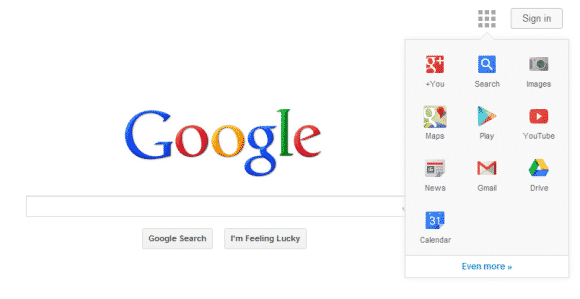
Thankfully, certain leaks now hint that Google is now trying to opt for a more elegant, user-friendly alternative. Much like a grid in the Chrome OS offers multiple Google services, the company is testing out a very clean home page with a tiny grid towards the top-right end. The grid, when clicked upon, reveals different Google services such as Play, Maps, Gmail, Drive etc.
The company hasn’t officially revealed that it is indeed testing out such a move and all a Google spokesperson stated when contacted was, “We’re always experimenting with the look and feel of our home page.”
From the looks of the leaked screenshots, the grid alternative to the current navigation bar seems very elegant and gives the home page a great, new look. We fervently hope that Google feels the same way and is so good as to implement it soon enough.
Source: Google OS blog
Courtesy: CNET
[ttjad keyword=”android-device”]