Millions of people love the BlackBerry, relying on it especially for email and text messaging. But this classic smartphone, while still dominant in the U.S., has been slipping in popularity as consumers, and even some corporations, eye two newer, simpler and more versatile rivals.Now a preview of BlackBarry for you all…..
Apple’s iPhone and Google’s Android operating system that runs on a plethora of phones. Both boast much larger ecosystems of third-party applications than the BlackBerry.A new Nielsen survey shows that only 42% of BlackBerry owners want their next phone to be a BlackBerry, while 89% of iPhone owners and 71% of Android owners plan to stick with those platforms.So, this week, the BlackBerry’s maker, Canadian tech giant Research in Motion, introduced a new model and a new operating system designed to counter these trends and better compete with the iPhone and Android.
BlackBerry, in the beginning, was a glorified two-way pager. It’s slowly evolved from that decade-old core into what it is today. Like Microsoft Office, a lot of people might use it at home, but it’s mostly designed for its corporate base. What BlackBerry tends to be good at, and what BlackBerry users love about them clearly exposes those corporate-tinged roots: well-designed hardware keyboards, push email (routed through RIM’s servers), BlackBerry Messenger (a robust, addictive BlackBerry-to-BlackBerry instant messaging service), communications security and encryption (see: Obama, Saudi Arabia, UAE). What it’s not been good at: basically everything else. I mean, if you want to highlight the philosophical difference between RIM and say, Apple, consider that RIM CEO Mike Lazaridis brags about how carriers love BlackBerrys because they conserve bandwidth, while Apple told AT&T to screw itself when the carrier suggested making the YouTube app less awesome for users by eating less data.
When you see that for the first time since 2007 BlackBerry is not the top-selling smartphone platform in the US, RIM’s looming problem seems a lot loomier. The Torch and BlackBerry 6 are RIM’s effort to avoid the same kind of fate Windows Mobile suffered by ignoring regular people and leaning too much on corporate IT departments to keep them in business, especially when Apple and Google are making inroads into the workplace.That’s a lot of context to swallow, but understanding the DNA and RIM’s incipient existential angst is the only way to understand the Torch: It’s like Two Face, but even less focused. Is BlackBerry 6 a touchscreen OS? A trackpad and keyboard OS? Mostly for business users? Regular people? It’s not quite sure, and the results can be pretty messy. The psychological split is real, and its imprint dominates nearly every aspect of the phone. FWIW, I’m looking at the phone purely from the role of a consumer—if your boss or IT department is handing you the phone, it’s not like you’ve got a choice anyway. Just thank them for giving you this one.
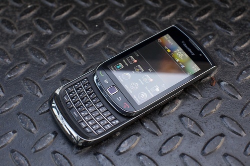
When we began our review of the BlackBerry Torch (aka the Bold 9800), our hearts were all aflutter. The leaked shots we’d been seeing of some kind of Palm Pre-esque RIM slider were different and frankly weird enough to cause a kind of low hum gadget lust. Furthermore, although no one on the Engadget team was blown away by what the company had shown us in recent BlackBerry OS 6 demo videos, the promise of a substantially revamped UI and new, Webkit-powered browser certainly got us interested. Even if Research in Motion had been slipping on its once-unassailable smartphone game, there was a sentiment amongst the team that the opportunity for a return to innovative, industry-driving design was wide open for the Canadian company. So when we got our very own Torch to play with, we were understandably excited. A new OS, a new form-factor (completely new for RIM), and from what we could tell, a new outlook from the company about where it wanted to target this product: namely, the average consumer. A great story in the making, no? But it’s a fiercely competitive market out there, with devices like the EVO 4G, iPhone 4, and Galaxy S line all vying for the hearts, minds, and pocketbooks of the buyer.
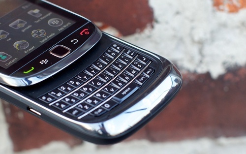
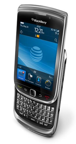
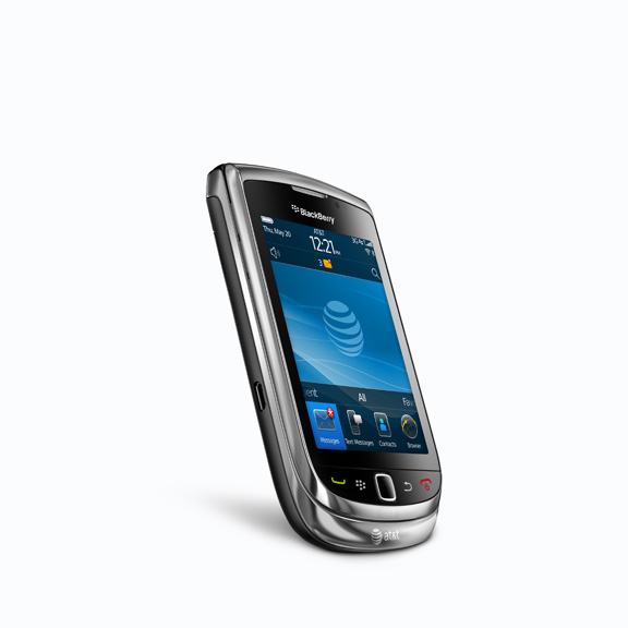
Not to rely too much on the trope that the Torch is “like a BlackBerry,” but the overarching industrial design and build really is just like everything else RIM has produced over the last year, simply evolved into a chromier slider form factor. While it works, almost shockingly well, because so little else has changed there’s a sense of the uncanny, a subtext of indecision surrounds the whole design.
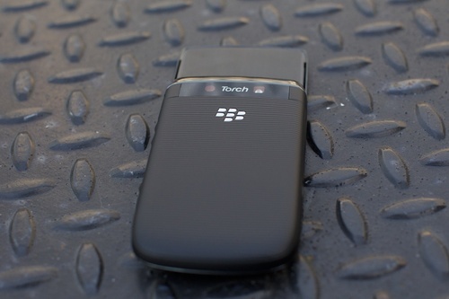
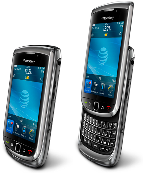
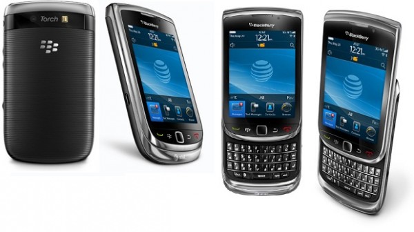
The Torch is as well-built as you could realistically want a phone to feel. The sliding action is smooth, perfectly balanced in the amount of effort it requires to shoot the screen up over the keyboard. It takes a push, and then it zips along the track until it clacks, satisfyingly. And it feels like you can do it 10,000,000 times. The rippled back is the right amount of rubbery, not so much it makes you hands feel weird, but textured enough the phone will never slip from even gross, clammy hands. The only issue is that the lock button on the left corner of the phone is too easy to trigger, so I pulled the phone out of my jeans pocket, an email half-filled out with jibber jabber or random phone number partially dialed, more often than I would’ve liked to.
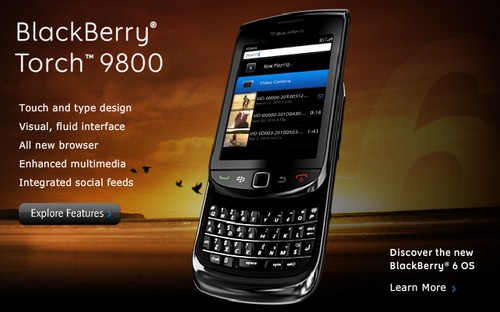
The new BlackBerry is called the Torch 9800, and it is the first BlackBerry with a slide-out keyboard, the first to combine both a touch screen and a physical keyboard, and the first to allow typing on either a physical keyboard or an onscreen virtual keyboard. It will be available from AT&T on Aug. 12 for $200 with a two-year contract.But perhaps the more important introduction is the new BlackBerry operating system, which will also be available on future models and as an upgrade for several existing models. Called BlackBerry 6, the new software aims to juice up the BlackBerry’s tired, utilitarian user interface and feature set.It is meant to simplify the cluttered home screen, and to add features such as universal search, multitouch gestures, decent Web browsing, improved social networking and more built-in apps.
I liked the way the device now has separate screens for frequently used functions; favorite apps, contacts and Web pages; media functions; and apps you’ve downloaded. The multitouch gestures, like scrolling through lists, and pinching and zooming, worked fine. The browser is finally usable, the app store is now built in, and there is a nice social-networking app called Social Feeds that combines status updates from Twitter, Facebook and other networks.
Icons seemed larger and more colorful, and it was easy to add photo icons of favorite contacts and Web sites to the new Favorites screen. Built-in apps that appear out of the box include Facebook, Twitter, MySpace, CNN, ESPN, and the Weather Channel.In addition, the new BlackBerry allows you to quickly check your latest messages and to control your network settings by merely tapping on a couple of bars on the home screen that drop down to expose the relevant information. And the formerly geeky and complex settings screens and menus have been simplified and made more graphical and attractive.
The music and video players are much more attractive and useful, and there is even a way to wirelessly sync music from a PC running iTunes or Windows Media Player over your home network, though it is complicated and time-consuming to set up and so far (as with wired syncing) only works on Windows PCs, not Macs.
After nearly a year of staring at screens packed with pixel counts of at least 800×480, the Torch’s low-res 480×360 display is a grisly sight. It’s like going back to standard definition after a year of HD, and then having a wet fabric softener sheet shoved in between my eyeballs and the screen. Text looks ugly and jaggy compared to the Droid or iPhone. Websites are grosser. Pictures less detailed. It’s almost a cruel joke AT&T’s playing on RIM, knowing it’ll be on pedestals mere feet away from the vastly better screens of the iPhone 4 and the Samsung Captivate. It’s unbelievable that anybody’s flagship phone in 2010 has a display this low rent. Even if you were absolutely determined to buy a new BlackBerry phone, you should wait for one with a better screen.
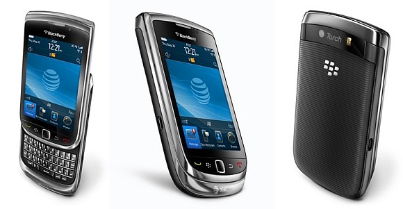
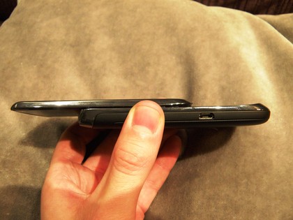
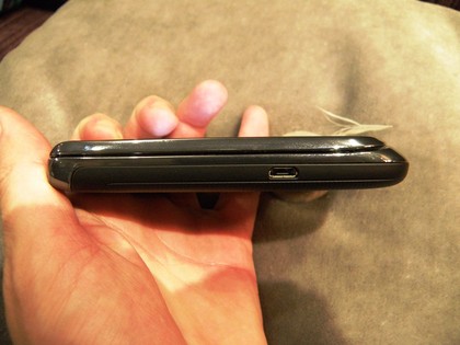
The size and shape of the device is nearly identical to the 9700, and in fact, its dimensions (4.4-inches up and down by 2.4-inches across when closed) are within spitting distance of the simpler, portrait QWERTY model. The thickness differs by a tiny margin (the Torch is 0.57-inches thick, while the Bold is 0.56-inches), though for some reason it feels much more significant when holding the two in your hand. Compared to more streamlined devices like the Captivate or iPhone 4… well, it has a full keyboard, okay? The Torch keeps the familiar, metal-like (it’s plastic) bezel around the edges of the phone, looping around back just as with the Bold, though this time it’s split in two pieces due to the separate screen and keyboard portions of the phone. The front of the device is mostly taken up by the Torch’s 3.2-inch capacitive touchscreen (480 x 360, just like the Storm and Storm2), though you’ll find the familiar BlackBerry call, menu, back, and end buttons and optical trackpad just below the display. Along the right side of the phone is a 3.5mm headphone jack, volume rockers, and user-assignable convenience key (it defaults to the camera), while the left side houses only the Micro USB jack. Up top there are mute and lock buttons, while the phone’s 5 megapixel camera and LED flash sit in a familiar spot along the back of the phone.
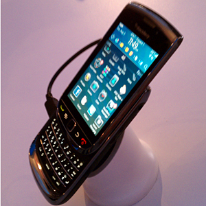
As you should know by now, the screen slides up on a nearly invisible metal track to reveal a rather traditional BlackBerry QWERTY down below. The sliding action feels quite solid, though it’s got some resistance, and we did have trouble quickly popping it open with our thumb once in awhile. The width of the keyboard is about the same as the Bold 9700, but slightly narrower, and the keys are more depressed than previous devices in RIM’s arsenal. Still, using the QWERTY was completely natural and our confidence while typing was nearly as high as it is when using the 9700. Nothing really compares to the spacious keyboard of the original Bold, but for a device packing a larger touchscreen, there’s little compromise. It blows the Pre’s keyboard out of the water, for sure.
Like the display, the Torch’s brains are straight out of 2008. It quickly becomes apparent that the 624MHz processor is too slow. It often hangs and stutters moving from app to app say from messages to Twitter to Facebook and back to the home screen—pinch-zooming in the browser, or sometimes even moving from app drawer to app drawer on the home screen (the latter less frequently, but it definitely happens). That’s even with 512MB of RAM, the same amount as the iPhone 4, Nexus One and other modern phones. Even if you found the performance acceptable (which, if you’ve spent time with an iPhone 4 or Android 2.2 phone, you won’t after about 10 minutes), it means that there’s not a lot of headroom for more advanced capabilities down the road: The guts seem like they’re being pushed to their max already.
However, this week’s moves are mostly catch-ups to iPhone and Android, and not a radical move forward for the super-smartphone category. One reason is that RIM can’t afford to alienate its loyal base of existing BlackBerry fans. In fact, a RIM software executive, writing on an official company blog, called the new operating system “fresh, but familiar” and assured current users that “when you look at it, it still looks like a BlackBerry Home Screen.” He compared it to a “home renovation.”he company was careful to keep some of the most familiar BlackBerry features. For instance, even though you can now navigate with multitouch gestures, the Torch still has the standard mini-trackpad and the usual menu and escape keys. The physical keyboard crucial to most BlackBerry fans is also very familiar in layout and function. The popular BlackBerry Messenger application has been retained.
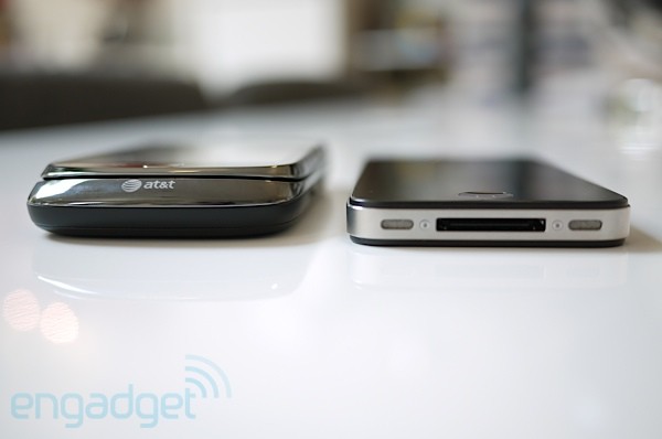
The Torch lags behind its rivals in some respects. For example, it has a smaller and much lower resolution screen than either the iPhone 4 or some of the newer Android models, like the Samsung Vibrant or the Motorola Droid X. Despite that smaller screen, it is also significantly thicker and heavier than the new iPhone or the Samsung, mainly because of the slide-out physical keyboard, which the others lack. Unlike on the iPhone and some new Android phones, there is no front-facing camera or video-calling function built in.While the Torch generally is smooth and responsive, I found it slower overall than the iPhone 4. And, in my tests, its browser—though based on the same technology as the ones on Android and the iPhone—proved consistently slower, though much faster and better than on earlier BlackBerrys. During my testing, the browser also began behaving strangely, freezing up at some moments and, in other cases, displaying only the graphics, not the text, on some Web pages.
As we said, the Torch sports a 480 x 360 capacitive display, which is adequate for the device but already a generation behind the competition in terms of resolution and pixel density. In fact, almost every smartphone we’ve reviewed this year save for a few low-end models sport a higher res display than the Torch. We’re unclear as to why RIM didn’t bring the screen up to at least 480 x 800, but we suspect it has something to do with backwards compatibility with apps. Compared to other displays, text looked blocky, and images didn’t have the clarity we would have expected from a smartphone in 2010. Touch sensitivity wasn’t outstanding on our review unit, making for a real lack of confidence when it came to finger tracking. We feel like there’s polishing to be done on the software side that would greatly improve the experience, particularly when attempting more precise pinch-to-zoom and swipe gestures (more on that in a moment). Oh, and SurePress? Nowhere to be found on the Torch.
Inside, the phone packs 512MB of RAM (doubling that of the Bold 9700 but the same as the 9650) and 4GB of hardwired storage, with a microSD slot for additional storage up to 32GB (you get a 4GB card in the box). As you would expect, there’s 802.11b/g/n WiFi on board along with Bluetooth 2.1 support, as well as an AGPS chip for when you get lost. Disappointingly, RIM is still using the same Marvell CPU found in the 9700, clocked at 624MHz (though the company claims this is a newer generation chip). In our testing, performance was sluggish in some areas, and we can’t help but wonder if it was a fault of the software or the slower processor speed. Not to harp on this, but with competition like the Nexus One and Droid X, it seems logical that RIM would put a little more horsepower into these phones.
The Torch has a 5 megapixel camera along with an LED flash, which is certainly a contemporary arrangement. There’s nothing particularly notable about the lens itself from what we could discern, though it’s clear that RIM has put a lot of time and energy into making the photo-taking experience on the Torch a more seamless experience than on its previous phones. It’s certainly easier to pick from a variety of preset modes, like portrait or sports, though we found the default setting to be fairly bad at capturing steady looking shots. For some reason, the camera was set to shoot in “continuous” mode, when single-shot provided much better results.
The slide-out physical keyboard looks a bit cramped, but, after a few days of use, I found it performed in the usual excellent manner of most BlackBerry keyboards.The onscreen keyboard, on the other hand, proved markedly inferior to those on the iPhone and Android. The keys are narrow, and easy to miss. And the keyboard doesn’t morph much to make specialized functions easier. When you’re entering an email address, it doesn’t display a prominent, dedicated “@” key like the iPhone does. RIM says this is because it expects users to rely more on the physical keyboard for such scenarios.
The Torch’s battery life is up to BlackBerry par, which is to say, thoroughly excellent. I’m talking a day and half of moderate usage, and a day of heavy plowing, without a recharge (granted, I didn’t use GPS very often because I didn’t like AT&T’s map application). Calls are loud and clear, though I noticed a subtle, high-pitched reverb not quite an echo—in the earpiece whenever I talked, on multiple phone calls. Reception wasn’t noticeably bad, but coming out of the subway more than once it took a few minutes to switch from EDGE back to 3G, and people more invested in the signal bar display might be nervous that it’s apparently quite sensitive even as I’m typing, it’s bouncing between 4 and 5 bars like an ADHD child who’s just been handed a giant box of Nerds. But no serious complaints.
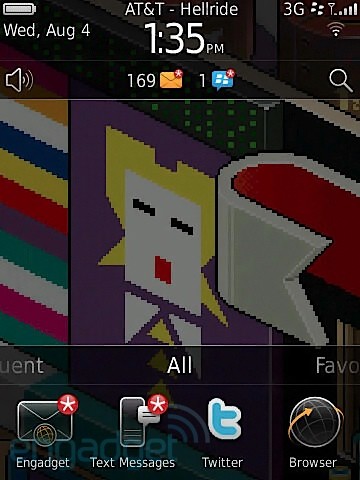
Of course, the real story with the Torch is not the hardware. Rather, it’s RIM’s next play in the OS department — BlackBerry 6. While it’s not the radical departure some were hoping for, the revamped operating system takes some extreme steps to deal with issues that have plagued BlackBerry phones for quite awhile. In particular, the company has canned its awful web browsing experience in exchange for a new Webkit-based browser, and Webkit also serves as the new underlying framework for email on the phone, as well as a new class of applications coded using web standards (sound familiar?). Additionally, RIM has gone to great lengths in 6 to reduce the “menus within menus” experience of the previous operating system and has included a powerful universal search alongside a social networking tool which allows you to aggregate RSS feeds and services like Twitter or Facebook into a single view. There are a lot of changes, so we’re going to go step-by-step through what we consider the biggest changes for the BlackBerry platform.
Overall, if you’re a BlackBerry user coming off of a OS 5 device, you won’t feel totally freaked out when you see the homescreen on 6, though there are some notable differences. RIM has cleaned up and smoothed out a lot of the iconography and text in the UI, making the whole OS feel much more cohesive and consistent. Graphically, BlackBerry 6 occupies the same space as OS 5, though it feels softer, more polished, and a bit more upscale. Nearly every part of the interface has been altered in some way, though the most notable changes are present in the homescreen.
In the previous version of the BlackBerry OS, you had two basic views, the first being a screen with your favorite (or top) apps, time, date, and message alerts, and quick access to sound profile settings. The second screen was basically your entire collection of apps and folders with little information otherwise (think: the iPhone homescreen). RIM has now joined these two views together by stealing a move from Android’s playbook: a window that slides up from the bottom of the display showing your apps. You can notch this window into place to show everything (four rows), or any variation between all and nothing. We kept ours at the standard view of four apps at a time (one row), though it’s easy to toggle between sizes. Not only can you bring this window up onto your homescreen and scroll vertically through it, but you can also swipe side to side for different groupings of apps, like “favorites” or “media.” You can also swipe on the top bar of this window when its reduced to move through groups of apps. RIM has also added a persistent notification alert to this screen via a small row of icons at the top of the page. This allows you to see social networking, email, SMS, call, and calendar alerts all in one place. Like Android, this drops down a separate window showing your most recent activity, and each notification can be clicked on to transport you to the app.
Everything on the homescreen seems designed to help you get to your most used functions quickly, which is wonderful. Tapping on the time brings up your network connection manager and alarm settings, tapping on the profiles icon lets you choose your sound setup, and hitting the search icon naturally brings up your search window (more on that in a second). It all works really well, and we feel like RIM has made the right amount of compromises here to make getting around the OS cleaner and easier. Of course, there are still lots of ways to do things in BlackBerry 6, so sometimes moving from place to place can get a little confusing. You have the choice of using the touchscreen, trackpad, or search for finding items, and in addition to the standard menu key to bring up contextual menus, long-pressing on items all over the OS reveals a separate context menu with many (though not all) of the menu key items. Just as with Windows Phone 7, the long press is a kind of mystery meat in this user experience it does what you’d expect it to do, but there’s a weird overlap with the menu key, and it’s inconsistent throughout. We’re guessing this has a lot to do with the fact that RIM is planning to update its older, non-touchscreen devices with the new OS while not necessarily a bad thing, it does create sometimes-chaotic interaction.
Menus and messaging apps have all been given the once over as well, and there’s now Storm-like inertial scrolling in lists. RIM has also altered the manner in which you adjust settings on the phone, giving you a more graphic-heavy menu to navigate preferences, which is a huge improvement over the lists seen in the last version of the operating system. While most applications will look familiar to BlackBerry users, there seems to be less clutter (we’ll look closer at specific apps below). One of the nice touches we liked in the OS is a method of selecting text by tapping at the beginning and end of the section you want with two fingers a really smart and useful idea.
If you’re a Bold fan, then you’re probably used to a pretty snappy UI… but you’re also probably used to seeing some freezes and ticking clocks. That doesn’t change with the Torch. As we said previously, the phone is running atop a fairly slow CPU (given the current climate) and RIM seems to be throwing a lot more at it — in terms of functionality and graphics than in previous phones. The result is a mixed bag: sometimes you feel like you’re blazing through the device, while other times you’re presented with an aggravating freeze. What makes it worse is that you’ll get the clock in some scenarios and not in others, so you may be frantically tapping on the screen while the phone’s display is totally static. In most modern smartphones, this is not a common experience. In fact, on almost every new Android device we’ve reviewed and certainly the iPhone 4, we never ran into issues where the device simply stalls out. It feels like the Torch is already butting up against the limits of its abilities, and nothing genuinely CPU intensive seems to be going on. It’s not like the phone is running 3D games in the background, that’s for sure.
The homescreen feels conceptually muddled too. Rather than going for a full desktop with definable shortcuts and widgets all over the screen, like Android, it blends a drawer system with a half-desktop metaphor in a way that’s less than natural. A handful of icons are visible, which can be dragged up, like a drawer opening skyward, to reveal more icons apps or now, contacts hidden below. When the drawer isn’t “open,” most of the screen is wasted space, just an expanse of wallpaper between the four visible icons and the status bar above. Flicking left or right takes you to a different “drawer” (or “panel,” in Android parlance). Each one is a section, like frequent apps, media apps, or downloaded apps. Oh, one interesting point is the pause RIM has inserted into sliding between drawers. It registers your flick, takes a second, and then moves to the next drawer. It’s an odd behavior, but so consistent it has to be deliberate. At the top is one of the more useful aspects of the homescreen, a notifications window like Android’s touching it drops down a list of messages and events from email or Twitter or whatever.
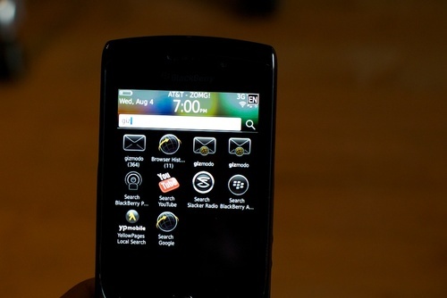
Universal search is awesome, and very much what it should be. If there’s one thing done truly well, interface-wise it’s universal search. Start typing for a contact, an app, a song, an email, whatever it’ll pull it up, or offer to search the web, YouTube, App World and others. You can basically bypass the rest of the interface for getting to something, at least a good portion of the time.
One of the biggest and probably the best new feature in BlackBerry 6 is the universal search function. Basically, you’re able to find just about any piece of content on the phone simply by beginning to type the name into the device. That goes for apps, music, contacts, notes, emails… hell, it’s just about everything. You can set preferences for what you do and don’t want to search, but it’s fast and simple enough that we didn’t feel the need to kill any categories. Since the Torch offers lots and lots of ways to get somewhere, this seriously simplifies things think Spotlight on a Mac, but on your phone and way faster. It’s actually the best search we’ve seen on any mobile device; it really delivers on the “everything at your fingertips” promise. In terms of new features that work the way they’re advertised on the box, RIM’s universal search is one of the few.
The BlackBerry 6 browser, now running on WebKit, is mostly on par with what other phones are offering since they’re using WebKit too—but not exceptional. The interface is cleaned up, and better, with a combined search/address bar. It rendered most pages the way it should (albeit still with no Flash), though in real world testing over Wi-Fi, it never beat an iPhone 4 on the handful of pages I tried, like Giz. Pinch to zoom can be laggy, particularly if a page is still loading. It is predictable and can be fairly smooth, once everything’s loaded. (Oddly, the whizzy effects to twirl between tabs never stuttered.)
Email also uses WebKit for HTML rendering now, and while the perks of BlackBerry are still there hello, push Gmail there are subtle annoyances, particularly when it comes to Gmail. For instance, a threaded conversation doesn’t show the sender of the email, simply the number of items and the subject. Moreover, for most people, the split between the phone’s inbox and the server’s which doesn’t exist with standard IMAP implementations, or a Gmail app feels awkward. The app itself is conservative, aesthetically. There’s a way to make email beautiful and functional; Windows Phone 7’s proven it. The allure of BBM as the be-all, end-all of mobile instant messaging is slightly diminished as well, given that Google Talk for Android accomplishes most of what I’d want it to do, and crosses the boundaries between phone and desktop.
Let’s look at mail first. Now, we’re primarily Gmail users, which means we’re not syncing this phone with a corporate mail account humming along on RIM’s servers. It also means that we’re in luck because the BlackBerry platform is pretty much the only place outside of Android that you can get a reasonably good Gmail experience. Archiving, threaded conversations, labels, starring, spam management it’s all present in a built-in plugin made specifically for Gmail. Getting started is easy, as it only requires your standard Gmail login. You’re then given an option to sync your contacts (it will sync your mail calendar whether you like it or not). So far so good. Once your email is setup, it’s pushed to the phone instantly, and changes you make on the phone (creating labels, archiving, labeling, etc.) are pushed back to Google’s servers almost immediately. Unfortunately, there’s one piece of this puzzle missing, and it’s a doozy: when you make changes directly in your Gmail account (in a browser), the changes take ages to get pushed back to the phone. In fact, sometimes the changes never seem to make it back to the phone. So if you just triaged your inbox on your computer, your phone will still make it look like you’ve got an inbox full of unread messages and they are unread on the phone. There seems to be a fundamental breakdown in this stage of Gmail for RIM devices, and it makes dealing with Gmail accounts on the phone a royal pain. Now, that may not bother a lot of users, but if RIM wants to attract the everyman to this phone the person who actually uses Gmail it’s going to have to do a little better than this.
On that note, what’s also confusing about RIM’s handling of mail is that you’ve got two inboxes your dedicated Gmail (or whatever service you use) inbox, and then your “messages” folder, which actually seems to catch more mail. That’s all well and good, but none of the Gmail features are present in this inbox (not even threaded messaging). That would be fine if you could ignore this messaging folder and just manage your mail in your proper inbox, but RIM forces you into this inbox because it’s the place those handy homescreen notifications take you if you click on them. Does this actually make sense to anyone in the world? Why does RIM give users two different inboxes with two sets of functionality to handle the same messages? The issue is further compounded by using searches within the Gmail inbox — this also presents another, slightly skewed set of options. For instance, when you search for a string, you can archive a set of those messages. You have to back out to the main inbox and go one by one. It is a deeply confusing and unnecessary system for handling email (Gmail, at least), and we really would like to see the company clear up these obvious problems.
Hey, we get it, BlackBerry users love this unified messaging inbox where they see all their SMS, MMS, BBM, and email mashed up into one place. But not everyone wants to handle their communication like that, and RIM doesn’t really give you a choice. It’s like the company threw off the Gmail integration as a lark, and just kind of tolerates the idea that a customer would want to have a separate inbox. You can set options to exclude your messages from showing up here, but then you lose out on that new quick jump to your email from the notification bar. In a perfect world, you would get the option to choose where that jump takes you for what messages or perhaps have an option that says “always default to X mailbox.” Just a thought.
And that brings us to the new social networking features of OS 6 namely, a new application called Social Feeds that combines all of your Facebook, Twitter, instant messaging (AIM, Yahoo!, and Gtalk), and RSS feeds in one handy place. The problem here is that, just like in other places on the phone, you feel like you’re being handed too many options to deal with the same content. For instance, a dedicated Twitter app is still loaded onto the device which ties into your messaging inbox, so you end up looking at Twitter messages in two separate places (oh wait… three separate places). The same is true for Facebook. And what’s really galling is that you can’t even use proper application functions in Social Feeds if you want to respond to someone on Twitter, you have to view the message in the Twitter app. It’s like RIM had an idea to combine every single service into one big silo, got cold feet, and gave us a half-step instead. We’re not necessarily saying that we would have liked to see everything in one bucket, but between dedicated inboxes, the combined messaging view, plus standalone Twitter, Facebook, AIM, and Social Feeds apps, the landscape for communication on the Torch (and OS 6) is fraught with mixed… um, messages. What should have been distilled into a deeply threaded function of the new UI is now just a messy jumble of seemingly random ideas about how people communicate.
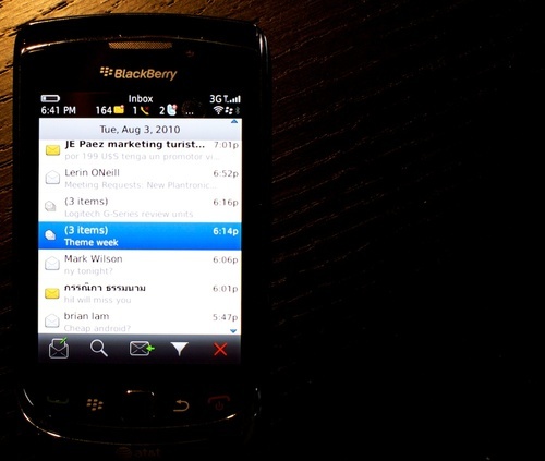
It’s strange that RIM sacrifices its own software at the whim of a carrier deal. BlackBerry Maps has been refreshed and made better, but you can’t actually use it. You’re stuck with AT&T Maps, which is slow and made me yearn for Google or Bing Maps. (You can sneak a peek at BlackBerry Maps if you try to preview your location inside of BlackBerry Messenger after sharing it. I wish I could’ve actually used it.) There’s even a separate AT&T AppCenter, which wasn’t quite working when I tried to access. Are people supposed to use the newly better BlackBerry App World (with carrier billing), or AT&T’s AppCenter? Other crapware includes AT&T Navigator, AT&T YellowPages, to start. It’s kind of an odd message to developers, whom RIM needs, in a way. BlackBerry’s become a distant priority behind iOS and Android for many, and a lot of the apps that are cross-platform are grossly inferior or straight up ugly on BlackBerry. (I’m thinking of Facebook and Foursquare, in particular.)
The distillation of this grand mishmash of observations and scenarios is this: BlackBerry isn’t good enough anymore if you’re comparing it to other smartphones. What does it do better than the rest? That’s the fundamental question. And the answer is that for most people, in most situations, compared to Android and iPhone, not a whole lot.People who love BlackBerry exactly the way it is will like the Torch and BlackBerry 6, because it’s pretty much the same. It offers a lot of marginal improvements in a lot of places like the browser even if it makes a mess of some things. That said, in a few months, they might like it a lot less. Nielsen numbers show that half of BlackBerry users are thinking about switching. This won’t change their mind. And even with all of those corporate accounts locked down tight, it’s hard to say that’s not a problem.
So, BlackBerry 6 got itself a bonafide Webkit-based browser, but does it fix the problems? In a word: yes. For the most part, the browser on the Torch is leaps and bounds beyond anything that RIM has put in a phone before. If you’re used to the experience of using a Pre, iPhone, or Android device, you’ll feel right at home. Web pages display correctly and reasonably quickly, and all the standard accouterments are here, including pinch-to-zoom, tabbed browsing, and text reflowing. Basically, it’s a pretty good mobile browser with some extra features that we really like (such as an actual cursor, which allows you to navigate sites the way god intended). But there are problems too, the main one being that it doesn’t seem like the Torch’s guts have the goods to pull off a seamless browsing experience, so when you’re zooming in and out and panning around you get a lot of freezes while loading, artifacted content that takes ages to render, and generally choppy behavior (as you can see in the video below). There’s also no support here for Flash or HTML5 video, so you’re limited to YouTube if you want to watch video on the go.
The media sections of the OS have been significantly revamped along with the rest of the apps here, so it should come as no surprise that they seem more polished and capable than previous versions. In particular, we like the new Cover Flow-esque browsing options, though for day-to-day listening we found the standard list view of artists and tracks a little more useful. We had little trouble getting music on and off the device, though we ran into a couple of problems with file format issues when syncing, and for video playback, the device scoffed at some MP4 files we’d loaded up.
As you may have heard, the newest version of BlackBerry Desktop allows WiFi syncing with your phone, meaning you’re able to wirelessly transmit music from your PC to your phone (Windows-only right now). In our testing we had mixed results. Some songs we couldn’t get to show up at all in our sync list, while others didn’t pass the litmus test for file format compatibility (word to the wise, if you’re a Zune user, be prepared to leave your WMV files behind). The concept is obviously great, but the execution needs a little work here — it’s far more confusing and inconsistent than we would have liked.
Notifications of new messages, including social-networking updates, seems much quicker than on previous BlackBerrys. Battery life was good in my tests, and the phone lasted through an average day easilPhone calls were crisp and clear. And, although the number of bars seemed about the same on AT&T as they did on the iPhone 4, and I could make the bars drop on the Torch by holding it in a certain manner, none of the limited number of calls I tried dropped. In my tests, the Torch downloaded data a bit more quickly than the iPhone over AT&T’s network, but much more slowly over Wi-Fi.
This may come as a shock to some users, but you can expect your favorite apps to not work with the Torch out of the box. RIM’s new OS doesn’t seem to permit much in the way of backwards compatibility, so we found ourselves high and dry for a few must-have applications (in particular, the entire suite of Google apps… and their web counterparts don’t recognize the browser properly, either). We had quite a few issues with apps not working (or not working properly) on the new platform, and even though RIM has improved the App World experience, there’s no differentiation in the store to tell you if what you’re about to buy will function with the device. This may just be a review-period-only situation, but it was frustrating to be unable to run a lot of software we actually wanted to use on the phone.
Beyond that, the apps we did run seemed fine, but we do have to once again take issue with the performance of this phone as it relates to the rest of the smartphone market. For instance, the Torch comes preloaded with a number of pieces of bloatware and a handful of games, one of which is Sonic the Hedgehog. Now, the game this port is based on is about 20 years old, and even our Treo 650 could run an emulator that played a pixel perfect version of the title (an arcade side-scroller). On the Torch, however, the experience is abysmal. Slowdowns, garbled audio, horrible controls. It’s actually kind of sad. Now compare that to the kind of fully developed 3D gaming we see on the iPhone, Palm Pre, and even Android, and it’s more than a little disheartening. It’s 2010 if these are “super apps” (Mike Lazaridis’ words), we’re expecting a lot more than this. We know gaming might not be a focus of most users’ needs, but they’re a great indicator of how flexible and powerful a platform is, and what we’ve seen doesn’t look promising. Coupled with the fact that RIM told us in a meeting that there would be no 3D APIs and no OpenGL 2.0 support for BlackBerry 6, we’re not feeling psyched.
As with every BlackBerry we’ve used, the battery life on the Torch seemed exceptional to us. In comparison to most other phones we’ve tested recently, RIM’s offering sits at the top of the heap in terms of longevity. There were actually a few days we tested without charging overnight, and when we awoke we were surprised to find that the battery indicator had barely moved even with lots of emails and messages coming down while we were sleeping. It’s obvious that the company has put a lot of effort into making sure that the Torch sips rather than gulps battery life, and they certainly seem to have succeeded. If you’re on the move a lot or a heavy user, you won’t be disappointed — and let’s not forget that you can always get a second battery or larger third-party battery if you’ve really got to go the distance.
The new OS will be standard on all future BlackBerry models, and owners of the existing Bold 9700 and 9650, and the Pearl 3G, will be able to upgrade to it.Overall, the Torch and the BlackBerry 6 operating system are good products that improve the BlackBerry experience considerably and bring the device closer to its newer rival
It’s tough to feel really excited about the BlackBerry Torch and OS 6 after heavy testing. We had high hopes coming into this review that the new operating system would be more than a fresh coat of paint on an aging user experience that we were going to see substantial changes in the attitude and direction of the company. While there are notable improvements here and much that is laudable, what we’re ultimately left with is, at its core, more of the same. For all the improvements in the browser, the more upscale fit-and-finish of the UI, and the thoughtful changes in basic functionality, we still feel like this device is a generation behind the market.
Instead of meeting the rising stars of the smartphone world (Apple and Google) head-on, RIM has taken something more like baby steps toward innovation. The company seems convinced that it’s got a better idea about what its customers want and how a smartphone should act in 2010, but we can’t say we agree. The Torch seems sluggish, underpowered, and dated from a hardware design standpoint, and BlackBerry 6, despite its new features and polish, still feels woefully behind the curve. To call the Torch the “best BlackBerry ever” wouldn’t be an understatement, but unfortunately for RIM and the faithful, their best isn’t nearly good enough.
Resources :engadget.com,gizmodo.com,online.wsj.com

![Read more about the article [Deal] AT&T Offers 50% Off On Smartphones Including iPhone 5S & Galaxy S4](https://thetechjournal.com/wp-content/uploads/2013/11/ATT.jpg)
gotta be the best review on any gadget I ever read.
You killed the phone, but truth gotta be said and I agree 100% when you point at 624Ghz slow motion CPU and the low res screen for RIM flag phone. No brainer….
Article stolen from Engadget
lebih rekomen mana antara tourch dengan onix2??
I find the Torch to be terrific. Things that matter to me: speed, ease of use, stability, battery life, and most important, phone quality. I can usually tell when someone calls me from an iPhone, because the voice quality is significantly inferior. And getting one day of battery life seems like a requirement! The fact that other phones (apparently) get less, would make them nearly unusable, for me.