The XPERIA X8 is the first to get a hands on video on the Sony Ericsson Product Blog. The video is short, but it’s enough to show that the UI has elements from both the big XPERIA X10 and the X10 mini.
Looking at the Sony Ericsson Xperia X10 and X10 mini, you just can’t help but notice the overwhelming difference in size between the two Android smartphones. In fact, this difference is so great, that one would hardly believe there isn’t something in between. Well, at first, there wasn’t, but just a few days ago Sony Ericsson filled the gap by announcing the Xperia X8 – a mid-end Android phone.
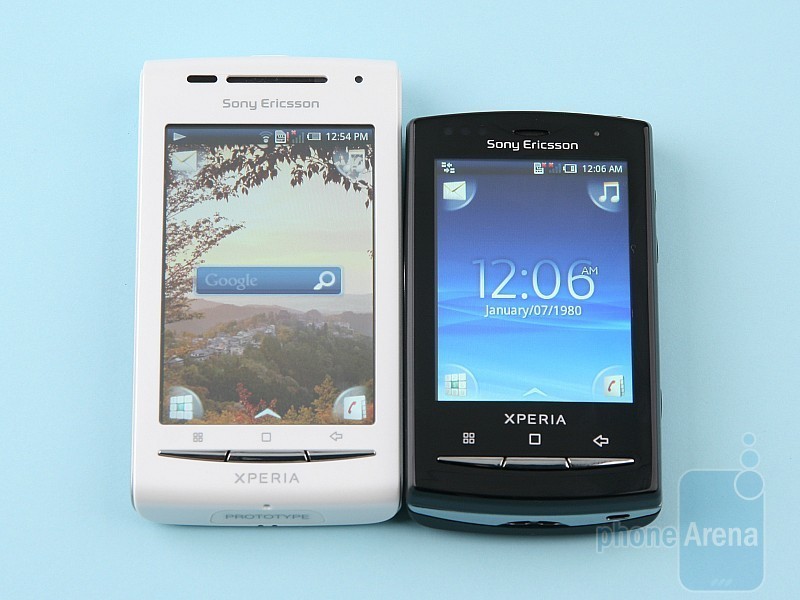
For good or bad, the Sony Ericsson Xperia X8 is more similar to the X10 mini, than the X10, which is mainly because of the fact that it utilizes the X10 mini’s user interface. On the hardware side however, it does a decent job at differentiating and conveniently establishing itself in the mainstream space.
Design:
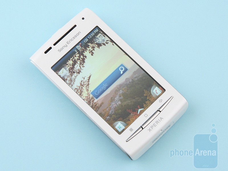
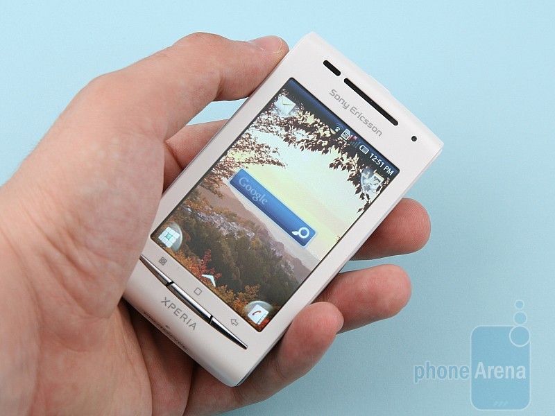
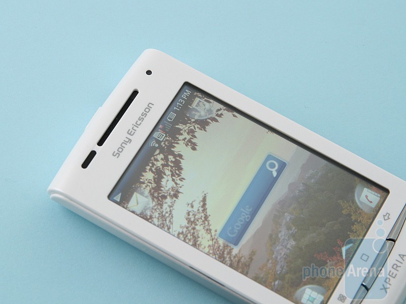
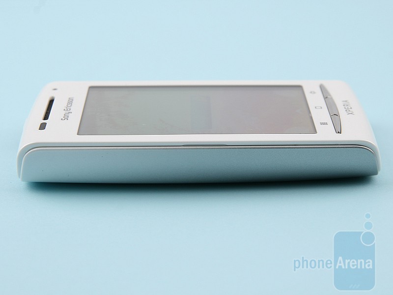
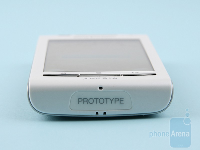
The Sony Ericsson Xperia X8 is pretty similar in design to the X10 mini. They may actually look almost identical, if you don’t get the chance to place them next to each other. In reality though, The X8 shows its superiority by treating you to its 3-inch capacitive LCD screen with resolution of 320×480 pixels – more than enough for this screen size. Because it is a standard TFT (IPS LCD or AMOLED have yet to work their way to the mid- and low-end), the screen suffers from some poor viewing angles, while the image quality itself leaves much to be desired. Although it should have 16 million color support, color gradients are far from perfectly smooth. Not that this is all unbearable, but we’ve come to expect a bit more from mid-tier offerings these days.
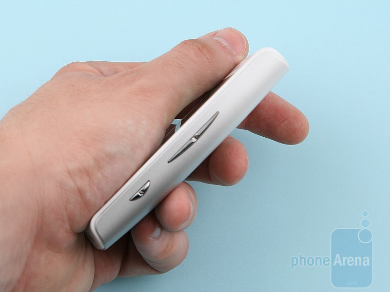
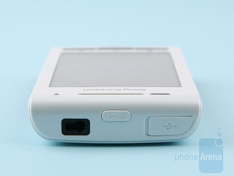
Below the screen you can find the mandatory menu home and back keys that are totally in the style of Xperia Andorid phones. The right side is where the volume rocker and one-step camera shutter (the 3.2MP camera lacks autofocus) are situated, and on the top you have the power/lock key, microUSB port and 3.5mm connector.
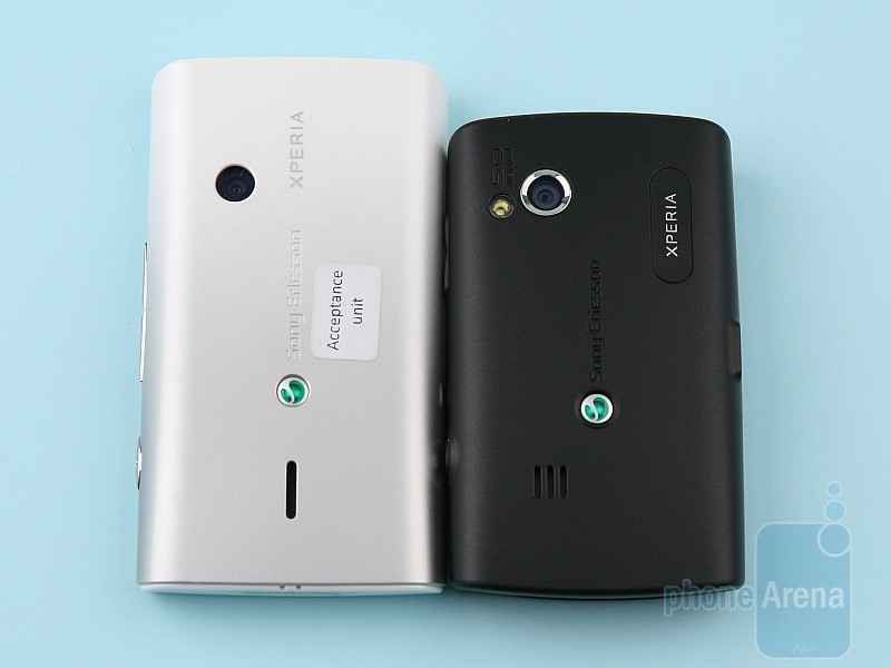
The Sony Ericsson Xperia X8 is by no means an unattractive phone. Quite the contrary, it is one of the better looking Androids out there. Unfortunately, the X8’s body has a bit of a cheap feel to it, mostly because of the plastic used for the rear cover. We would have definitely preferred the X10 mini’s soft-touch matte coating. Nonetheless, it is still a very elegant device to say the least.
Inside and Functionality:
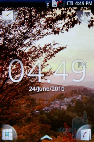
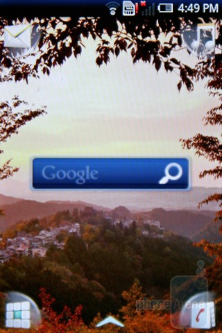
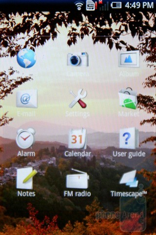
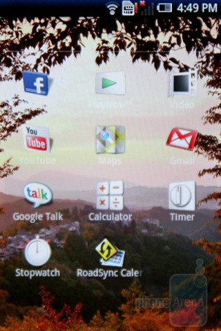
The software running on the Sony Ericsson Xperia X8 is neatly personalized by the optimized version of the UX interface, or in other words, it’s the same personalization we saw in the X10 mini. In our opinion, it is a quite intuitive and convenient solution, perfect for handsets with relatively small screens.
There isn’t much to describe here: at the top you have Android’s notification bar, in the four corners of the screen you get shortcuts to your most frequently used apps, from the bottom you can pull the main menu, and you also have multiple home screen pages with only one widget per page. The last characteristic starts to feel just slightly annoying on the X8’s 3-inch display, but we can live with it.
We noticed that unlike the X10 mini, there is some noticeable loss of frames here on the Sony Ericsson Xperia X8, while using the handset for ordinary stuff. This could, however, be due to the prototype nature of our unit. Plus, we played Raging Thunder II without a hitch on the handset, so we aren’t worried about its general performance.
You can find more details on the interface in our Sony Ericsson Xperia X10 mini Review.
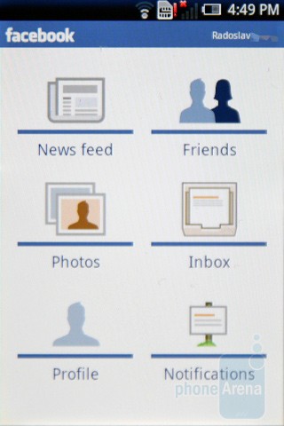
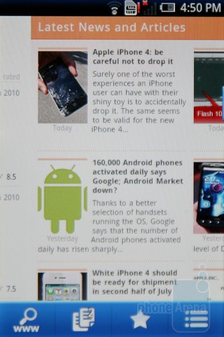
Social networking on the Sony Ericsson X8 is… handled by the available applications for the platform, with the exclusive part here being the Timescape app (although 3 inches are fine for multimedia purposes, the Mediascape app is still out of the business here, but we don’t feel too bad about it). What Timescape does for you is to act like a messages and missed calls log, plus it integrates updates from Facebook and Twitter. It’s a decent try, but not functional enough. For example, it doesn’t show you the whole tweets, and when you attempt to tap on a tweet or update, hoping to see more of it, you get redirected to the mobile web page of the respective service. Not really deep stuff.
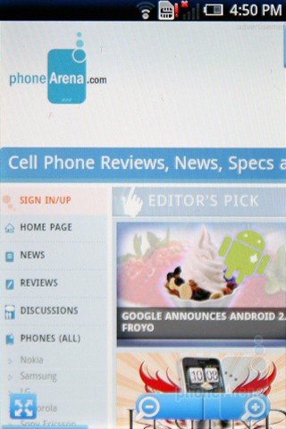
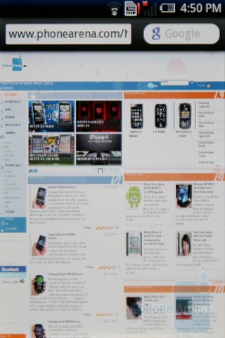
To our disappointment, the internet browser lacks pinch-to-zoom or double-tap zooming, which makes it pretty useless. Alright, it is not that bad, but it’s that bad when you pit it against multitouch-capable phones, or at least phones that rely on much better zooming solutions like double-tap, or one-touch. Interestingly enough, one-touch zoom is available in the photo gallery and works like a charm. Even more, it is a super-easy to use and convenient feature. Why it is not available in the browser is beyond us. You know, one of those questions. The bad thing here is there seems to be no better alternative in Android Market, and this includes Dolphin and Skyfire. Opera Mini 5 is indeed a lot better in terms of navigation, but its functionality is limited. Otherwise, scrolling in the standard Android browser is smooth, pages render like they should, and Flash is missing. There isn’t much more to say about it.
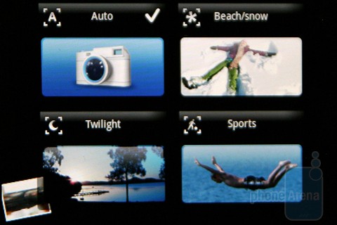
The 3.2MP camera without autofocus or flash is powered by the same interface found on the X10 mini, i.e. pretty simple and straightforward stuff, with four presets for the photos (Auto, Beach/snow, Twilight and Sports) and two quality modes for the videos (Normal and For MMS). The Gallery app works great with its smooth transitions when swiping between photos and the above-mentioned one-touch zoom feature. Think of the camera samples below as “prototype samples”.
Sony Ericsson Xperia X8 sample video at 640×480 pixels resolution.
The Sony Ericsson Xperia X8 is a very stylish offering that finds a pretty good balance between being compact and functional at the same time. We like its design and interface and believe there’s a pretty decent chunk of the market that will find it great. At this point however, we don’t think it will be able to fulfill the needs of power internet users, because of the downright poor navigation in the browser. We still hope for a miracle in the final unit, but judging by the X10 mini’s final version, our chances are not very bright. If you plan to use it mainly for its other purposes, plus gaming, the X8 seems to be a pretty adequate mainstream smartphone thanks to its good looks, capacitive display and steady performance.
Video Preview:

WHY DID SONY BOTHERED TO MAKE THIS PHONE..WITHOUT GOOD INTERFACE FOR INTERNET ITS DOOMED…..
ArchitectDesign: LOL! They were doomed when they released rumors of an X10 years ago, everyone drooled over it. Spec-wise it was the hottest thing out errr…not out. Fast forward to when they finally released it. It came with Android 1.5 or 1.6 (can't remember), reviews stated even with a 1GHz processor the X10 was sluggish with the Sony UI over top Android, and then they stated the hardware wasn't capable of multitouch. What a joke. Sony needs to shut down their offices and move on. We had a nice Sony TV that died (see Grand WEGA SXRD 52″ class action). They're not the old Sony they used to be.
The competition now (Droid X, Evo 4G, Samsung Captivate, etc) made the X10 look like a Fisher Price my first smartphone they defecated on Sony so badly. Forget about the original Xperia which was hyped for ever then ended up being COMPLETE AND UTTER GARBAGE! Trust me, I bought one for $700 just to demo it and return it, day 2 the entire screen went white and it did. No matter to me, it was terrible.
I don't know who makes decisions at these companies but I should replace the person in charge of the Sony smartphone division.
These hardware manufacturers need to STOP trying to make software and STICK TO HARDWARE!! Google's job is to provide you with the Android platform/software so stop mucking with it. Look at the fkng trends for crying out loud. Do these people (Sony, and whoever makes the TouchWiz interface, I think it's Samsung?) listen to people? Do they read blogs? If they did they'd know people want stock Android. And we don't want a new phone with an outdated OS. We want fast updates and fast hardware. If they stuck to making hardware it wouldn't take them so long to release a new phone. Instead they announce specs, say we're working on our interface and by the time the kinks are worked out and the phone released it's already antiquated.
I applaud Motorola at least for dropping a hot phone the Motorola Droid with a keyboard for starts, and vanilla droid. They're also dropping the Droid X and didn't put a full blown craptastical MotoBlur garbage on it like they did with the CLIQ etc. At least some companies are listening.
The phone is great for somebody who don’t want to spend to much money for first Android phone. I think the SE did good phone for the price.
how to zoom camera while taking photo or vedio in xperia X8