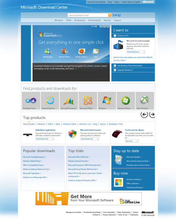
Microsoft’s download center has now been redesigned with Metro’fied and easier to use. The new Metro UI style made famous by Windows Phone continues with the quiet relaunch of the Microsoft Download Center page that has been redesigned to make extensive use of the Metro UI, redesign was to make it easier for people to find the things they want………..
Microsoft has just released an updated design for its Download Center and there are two reasons why this story matters: Microsoft is continuing to incorporate the Metro design aesthetic into its every property, be it an application, website or mobile user interface and that the one billion people per year who land on the Download Center webpage will now, at last, have something less ugly to work with. The redesign is yet another falling domino in the rise of Metro at Microsoft. Metro is the company’s design scheme that it is incorporating into Zune, Xbox, Windows and now the Download Center. If it is Microsoft product, there is a good chance in the next year that it will have gone Metro. Metro is a method for using large typography, squares to represent and share information and pages that flow together in a group to produce a swiping feel. Microsoft’s Download Center does one billion hits per year, breaks down to 114,000 hits an hour or a little under 2,000 per minute. In other words, the Download Center is a key part of the Microsoft’s software distribution system. If Microsoft can raise the success rate in which users actually find what they are looking for, then it will have safer and happier customers. That would make for a better bottom line.
[ttjad keyword=”microsoft”]


Microsoft downloaded center to redesigned for easy way to download and getting best of the result with which. Also you the best performance to provide a Microsoft.