For long time, Facebook has kept testing with new designs for the site and now, the social network has unveiled a new outlook for the News Feed. This time, the revamp is not major but it still brings a lot of new design elements.
The last News Feed redesign that Facebook rolled out nearly a year ago, wasn’t exactly a public roll out. A vast number of users are yet to have their Facebook accounts updated to that look. Facebook has now deemed that redesign as somewhat of a ‘test’ which contained certain problems. This is probably why it was not made available to all users.
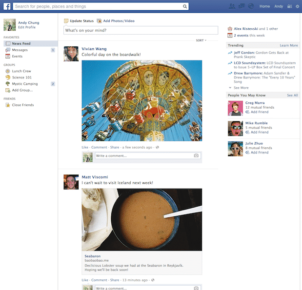
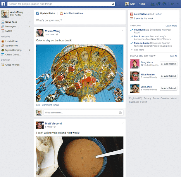
However, the social network has worked up a new redesign which is apparently better than the last one. It isn’t a lot different than the previous visual update in terms of looks. This new design comes with a scarcely-populated and neat left sidebar. Moreover, the drop-down menus at the left top corner of the page have been removed and replaced with only the search bar.
Here’s what the updated News Feed looks like:
This is what the old News Feed looked like:

The new design is still photo and video centric and so, is heavy on the visuals. But it is also more organized and neat, making the News Feed appear a lot less cluttered. Naturally, it will take the users a while to get the hang of it. Facebook says that the new design will be rolled out to the users over the course of the next few weeks. Meanwhile, rest assured that the changes only affect the visual outlook of your News Feed and don’t impact the way stories are ranked.
Source: Facebook
[ttjad keyword=”laptop-lenovo”]


![Read more about the article [Tutorial] How To Delete Your Every Facebook Search History](https://thetechjournal.com/wp-content/uploads/2014/02/Facebook-Activity-Log.png)