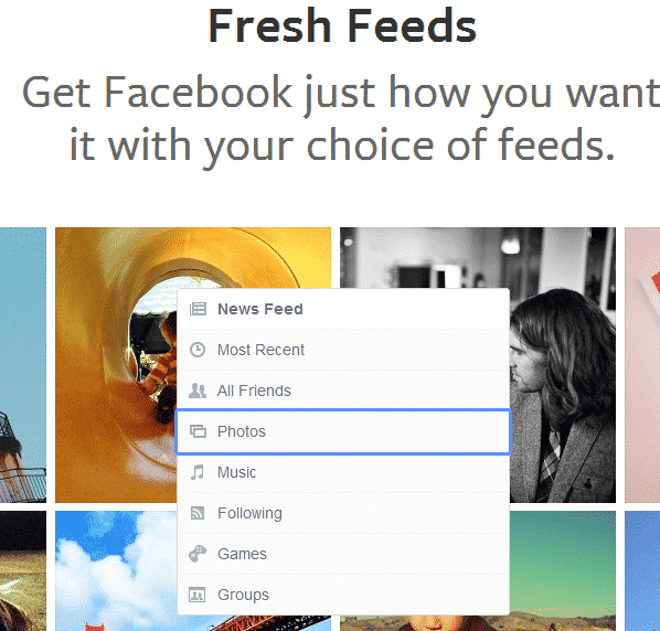
We have been hearing of a new look of News Feed that Facebook had been working on for a while. There were hints that this new look would be image-centric. Now, the social network has finally lifted the wraps and allowed us a peek of what we may get in the coming weeks. And we have to admit, the new look for the News Feed is rather neat.
Facebook has detailed out all the new features of the new News Feed look on the page here. Apparently, the new offering is being rolled out to the web-based Facebook users but will be limited for now. Yet, you can join the waiting list by hitting the link cited above.
The mobile users will have to wait longer, although the company promises that redesigned interface will reach iOS and Android devices in the coming days. Given below is a quick rundown of all the new design features that Facebook has added to the News Feed.
Four News Feed categories:
The current News Feed that we view every time we log into your Facebook accounts is rather cluttered. And to sift through it to find such content that is of more interest to us is somewhat bothersome. Facebook is all set to change this by offering distinct News Feed categories in the new design.
There are four categories that Facebook will be offering. The ‘All Friends’ feed is the general category which lets you view everything that your friends are sharing – it is more or less the same as the current feed, minus the updates from pages and groups.
Another category is titled ‘Photos’ which, as the name suggests, allows you to view only the images shared by your friends and the pages you have joined.
The third category ‘Music’ helps you filter the news feed items and view only such posts from your contacts which are about the music they are listening to. And finally, ‘Following’ category is very useful in that it offers you content exclusively from the pages you’ve liked and the people you follow, doing away with the random, regular stuff from your contacts.
The categories make it very easy to view the content of your current News Feed in a more organized and intuitive manner.
Better chances for Facebook pages:
The company claims that with its new image-centric News Feed and the ‘Following’ category on the home page, users will be able to access content from Facebook pages more easily. This, in turn, would help the pages gain more traction and attract newer followers. Moreover, posts from a given Facebook page will be accompanied with that page’s cover photo – which means that the visual appeal of the cover photos has to be really good in the revamped News Feed.
Consistent design across multiple platforms:
This is probably the key behind Facebook’s decision to revamp the News Feed. The new look of the News Feed is flexible and it will essentially be consistent across multiple devices. For instance, the way Facebook’s News Feed appears on the web will be more or less the same as appears on tablets and smartphones. That is a huge move towards achieving design consistency across multiple platforms and Facebook seems to have done it right.
In all, the company has really pushed new design boundaries here and the new image-centric look is eye-catching, to say the least. Other design features of the revamped look will transpire upon us in the coming days, once we are able to try our hands on it. Watch the video below to see what made Facebook go for this new look:
Source: Facebook
[ttjad keyword=”social-media-samrtphones”]


