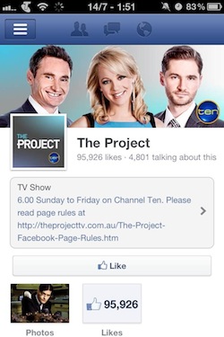
Facebook has started to roll out its Timeline design for pages of the mobile devices this week. One Australian reader has sent a screenshot to a Facebook related blog, Inside Facebook, as you can see below. The design now includes a page’s cover photo, detailed information from the “About” section, and new icons on the page to view a page’s photos and details about the page’s Likes. If you use iPhone app for Facebook then you may see the pages featuring a larger Like button, measuring across the width of the screen.
According to the source, some pages of the mobile web version have a smaller ‘Like’ button because of the Message button. When Timeline for personal profile was launched on desktop then at the same time, it was rolled out on mobile. On the other side, Timeline for pages on mobile devices has taken much more time.
However, a spokesperson said, “We aren’t making any changes to mobile pages today, but we’re dedicated to making the experience on mobile consistent with that on desktop soon.”
Source: Inside Facebook
[ttjad keyword=”social-media-samrtphones”]


