Did you know that there was a device very similar to the iPad 20 years ago? It was called Dynabook, and it was designed by computer genius Alan Kay back in 1971, and was made in 1989 by Smart Design.
The idea of a tablet device isn’t new at all. In fact, it none other than Apple that asked a couple of firms (including Smart Design) to come up with some ideas for a tablet computer.
The Mac products at that time were basic and beige by today’s standards.
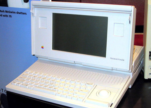
The Macintosh portable had been introduced in 1989…about as big as a medium sized suitcase; the joke was that it was more “luggable” than portable.
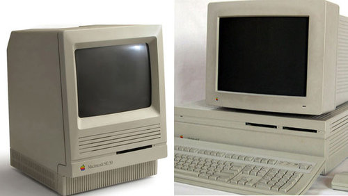
The rest of Apple’s lineup consisted of the classic Mac SE and the hulking Macintosh II, typical of desktops at that time.
In 1989 there were no brightly colored computers, no cool graphic cases, and no sleek silver laptops. There was no Newton, no iPod, and certainly no iPhone. Sony owned the portable music market with the cassette equipped Walkman. In 1989 the World Wide Web was still an idea.
The two-page project design brief from Apple included a line drawing of a rectangular slab form with a few basic dimensions, an indication of the screen size and approximate weight. The client asked for the delivery of two designs in the form of non-working appearance models and five images of each design showing how people would use them. The project timeline was 30 days—start to finish.
Who could ask for a more exciting project? This was about the future, and in that future, computers would be cool personal devices. Computers would be as much about entertainment and fun as they would be about productivity. Computers would take pictures and play music on high quality built-in speakers.
Computers would be mobile and you might even be able to use them outdoors!
My partners Davin Stowell, Dan Formosa, Tucker Viemeister, and I wasted no time getting to work. A week or so later, two concepts started to emerge from the pile of sketches and crude mock-ups.
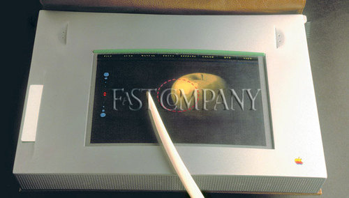
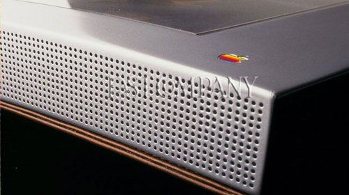
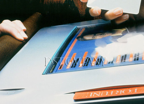
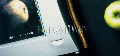
The first concept, which Tucker and Dan led, closely followed the minimum rectangular requirement but boldly suggested that the case would be made from aluminum with precisely machined holes for the speakers and details.
A slit-like opening on the top surface enabled the insertion of a memory card (credit card size) for storing applications and files. We thought that someday, catalogs and magazines would arrive in the (snail) mail in the memory card format for viewing on such a device. (What were we thinking?)
A high quality lens positioned on the top edge would allow people to capture images for direct viewing on the screen.
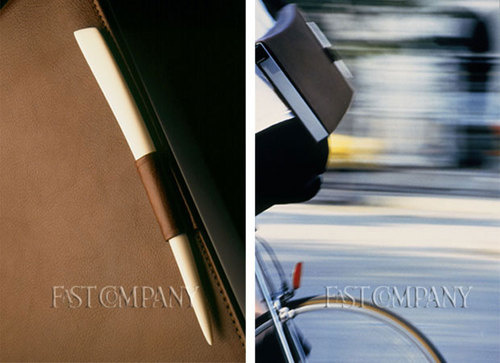
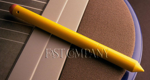
To protect the screen and to give the tablet a folio/briefcase appearance, a brown leather cover was added. The cover was secured closed with magnets and a handy loop was sewn in to hold the bone-like stylus in place during transit.
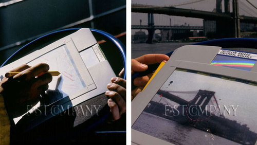
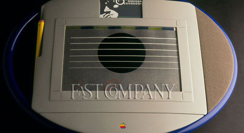
For the second concept, Davin and I wanted to propose a design that was much more sporty and robust, a design that said: take me outdoors, use me at the construction site, take me camping, and play me like a guitar—or possibly even use me on a walk in space.
To promote this notion, we surrounded the rectangular form factor with an oval ring that fashioned a carrying handle and encouraged people to use the device in a portrait orientation, as well as the traditional landscape format. The built-in camera (activated by clicking the top of the stylus) could be used for capturing images, and advanced software allowed the user to draw or make notes on the image.
This was our Guitar App (take that Rock Band) which allowed people to play along with Roy Orbison on the memory card. You would use your fingers to strum—hey, it’s the first “multi-touch” screen!
Adjacent to the screen was the speaker area covered in real fabric and the stylus resembled a high tech yellow pencil. One could enter information with the pointy end of the stylus and delete with the pink colored digital erasure end.
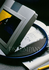 The oval ring provided a base allowing the device to angle up for desktop viewing, as well as scanning from books, newspapers, and magazines.
Needless to say we were very excited as we packed up the two models for shipment off to Apple. We even figured out a way to make the screens light up when they took them out of the box. About a week later we received a message from the client informing us that they had received the two designs. After that, we never heard another word from them again. We heard from some designer friends that IDEO was chosen to continue the project. Then, a few days later we saw someone from IDEO and they said they thought we got chosen. Who knows? Four years later, Apple came out with the Newton and the rest is the history we all know.
Now 21 years later, pads, pods, and tabs are hot. Technology can now support our “radical” vision of the future. While Smart Design has not worked with Apple much in that time, we have continued our journey with technology both in terms of the hardware and the software. On a recent project, we envisioned how magazines and newspapers might play out in the new tablet world.
Source: Gizmodo.

