MeeGo Phone UI screenshots is now official with Dual Lock screen, highly customizable themes and UI mechanics…..
Some more MeeGo screens from the MeeGo blog. It’s part of the UI guidelines and is quite informative of what’s coming to MeeGo. Note that this is the stock version and that there may be differences depending on manufacturer customization. As you’ll see from the blog page, MeeGo UI is highly customizable.
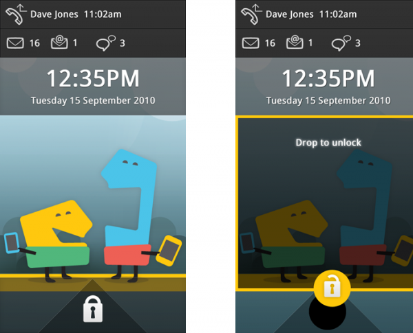
First lets look at the standard lock. The idle lock has a lot of relevant information including missed calls (and at what time), text messages, email messages and IM. There’s a big clock and then the date, underneath which is the lock wallpaper.
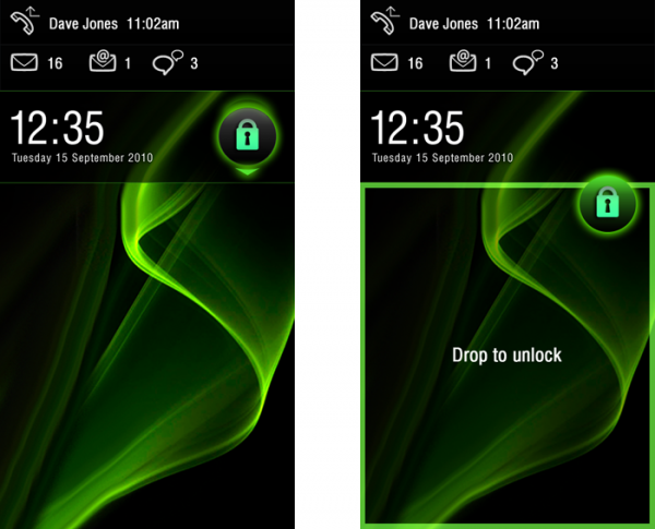
There are two lock mechanisms. The one below you have to drop the lock button into the square space underneath the clock. There’s no swipe to unlock or code or any particular drag combination. Just drop it in the unlock space.
Alternatively, you can drag and drop from the top downwards.
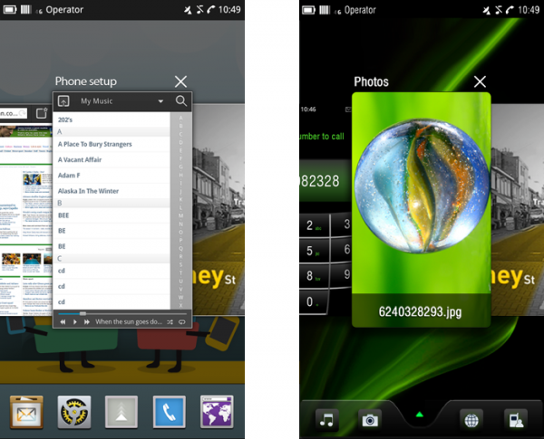
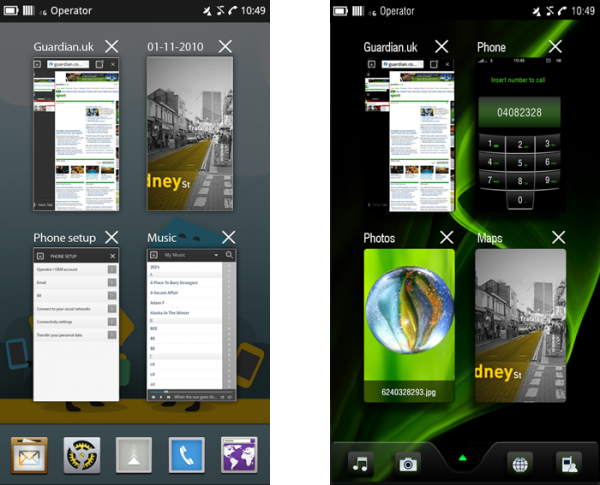
Multitasking has two views in MeeGo. You have the Nokia N8/Palm Pre like linear carousel multitasking of LIVE applications. Similar to Maemo 5, the background is similar to homescreen except darkened and blurred. Nice touch.
According to the blog page, the size of cards, amount of card overlap, zoom, and speed of carousel can all be modified in themes.
Alternatively there’s a Maemo 5 style grid view (Maemo 5 arguably has the best multitasking interface for a power user, with contextual automatic sized grid of live windows).
Notice on the second screenshot, what’s titled as maps and what appears to be a Google street-view esque page.
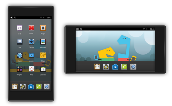
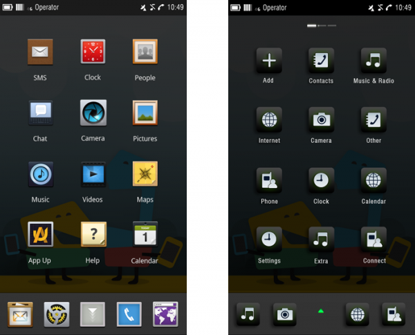
This is the standard App Launcher view. You have a 3×4 grid and the persistent launcher bar. Whilst many customizations are again noted (Icon size, font, sound, haptics, feedback graphics), there was nothing about changing grid size to accommodate more apps. 4X5 should be standard of 3.5″ screens and above, though it is made difficult with narrower aspect ratios
You’ll notice that you can switch sideways to more app pages (see in second screenshot the indicator at the top). In addition to the launcher bar (or quick launch bar), this part is quite iPhone like.
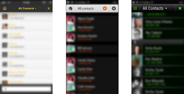
Similar to Maemo 5, to focus your attention on a particular part of the screen, the other parts are out out of focus – blurred a bit.
There’s much more detail over at the MeeGo Blog page.
The minions at Nokia and Intel’s little pet project have posted new OS shots as examples of how to properly implement the interface in third-party apps, and we’ve got to admit — things are looking a lot cleaner, prettier, and generally more modern than the first round of pictures we saw back in June, thanks in part to a demonstration of the platform’s comprehensive theming capability that can totally revamp how UI elements look. We’re definitely seeing shades of webOS in the task switcher (pictured above), but then again, Nokia’s no stranger to borrowing ideas it likes.
Resources :mynokiablog.com,engadget.com

