Nokia’s Mini N97 is a more compact version of Nokia’s flagship smartphone. The Mini N97 also gets the bonus of kinetic “flick” scrolling, which greatly improves Web and menu navigation. But the Mini N97 has the same issues as its older sibling: The S60 OS interface feels out of date and lacks the ease of use found on other operating systems like Android, iPhone, or webOS.
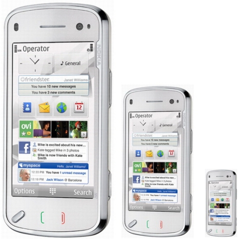
The Nokia N97 Mini is only slightly smaller than its older sibling, measuring 4.5 by 2.1 by 0.5 inches (the original measured 4.6 by 2.1 by 0.6 inches). It is also a bit lighter, weighing 4.9 ounces, or 0.4 ounce less than the original.
While the dimensions seem little different, the Mini N97 feels much more comfortable in the hand than the somewhat bricklike N97. Its high-quality plastic body feels durable. Two touch-sensitive buttons (Talk and End) lie below the display, as does a hardware shortcut key to the menu.
The Mini N97’s call quality over T-Mobile’s 3G network was impressive. I heard no static or background hiss, and voices sounded crisp with an ample amount of volume. Parties on the other end gave similar reports. Even when I stood on a busy city street corner, my contacts said my voice sounded loud and clear.
In my review of the N97, I griped that the bottom edge of the tilted display was too close to the top row of keys on the keyboard. I didn’t have this issue on the Mini N97, though; I’m not sure if it was due to the smaller design or if I’ve gotten used to Nokia N-Series keyboards after reviewing so many. The keys are raised and nicely backlit, and despite the reduced real estate, my fingers didn’t feel cramped while typing long messages on the Mini N97. The Mini N97also loses the four-way directional pad seen on the N97. I don’t miss it, though, as I found it difficult to press.
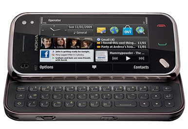
The 3.2-inch display (downsized from the N97’s 3.5-inch display) is resistive-touch as opposed to the capacitive-touch technology of the Motorola Droid and the iPhone 3GS . Resistive-touch generally requires a little more pressure on the screen. The display felt more responsive than the original N97’s. The Mini N97 also has haptic feedback (a slight vibration when you touch an app), which helps with the navigation.
Scrolling on the original N97 was a bit of a pain, and you really had to push down hard on the display to scroll through a Web page or an e-mail. Thankfully, Nokia took note and gave the Mini “flick” scrolling. Like the iPhone’s UI, you can literally flick the display to begin scrolling. The result isn’t as silky as on the iPhone (you have to “flick” a little harder), but it is definitely a welcome improvement.
The S60 fifth edition operating system still feels unrefined when compared with webOS, iPhone, and Android 2.0, and unfortunately the smaller display (3.2 inches as opposed to 3.5 inches on the N97) only makes things worse. The typography and icons are tiny, and they fade into the background of the display. Opening an app requires two clicks, one to select the app and one to open it. Pressing twice gets old fast, especially when you’re used to just about every other touchscreen device out there with one-click access to apps.
While the interface might not be the best-looking, the live-feed widgets are useful if you want to quickly check the weather or catch up with your friends on Facebook. The widgets update your personal Internet feeds in real time on your home screen so you don’t have to open up another app to access them. You can have up to five widgets on your home screen (the clock can’t be budged) and arrange them in any order you see fit. The Mini N97 comes preloaded with a calendar, Facebook, Amazon, a widget that lists your contacts, and many more.
Setting up your Web-based e-mail account (like Gmail or Yahoo) is a snap: You simply enter in your username and password, and the Mini N97 does the rest. The Mini N97 also supports multiple accounts.
The Mini N97’s Web browser is okay for casual surfing, but it needs a bit of refinement. To zoom in to a page detail, you have to type on it twice or rely on the zoom bar. Either way, you still end up tapping the screen way more than necessary. One plus: The Mini’s browser supports both Flash and Java—something the other smartphone giants don’t do yet.
The uninspired, but capable music player supports a wide variety of file types including MP3, WMA, WAV, eAAC+, MP4, and M4V formats. It has no visual effects or album art scrolling (as on the iPhone and the Previous). Nevertheless, it is quite easy to use with the display’s large touch controls. Overall, music playback sounded very good. The video player is equally simple, but good nonetheless. However, you don’t get DivX or XviD support out of the box.
The 5-megapixel camera has a Carl Zeiss lens (and a cover), a dual LED flash, and a few advanced features and settings. The image quality of my indoor shots disappointed me. The photos looked grainy and either too dark or too blown-out from the flash. Snapshots taken outdoors fared better, however, with sharper details and better color balance. You can record VGA video at 30 frames per second; my test videos looked decent, but I detected some artifacting in a few clips.
The Mini N97 has a strong set of specs, a variety of multimedia features that work well, and a solid design. And the addition of flick scrolling is definitely a big improvement to navigation. Unfortunately, the Mini is hindered by the Symbian S60 OS. It simply lacks the silky user experience we’ve grown accustomed to in touchscreen devices.
Source: macworld.com


Thanks for making such a killer blog. I come on here all the time and am floored with the fresh information here.