Nokia is just about to release on a still unknown date it’s latest mobile phone OS – the Symbian S^3, but it would it seem that it is already working on the next version – the Symbian S^4. After a brief demo of what the S^4 would look like sometime in December 2009, Nokia is now releasing some more juicy information about its upcoming mobile phone OS.

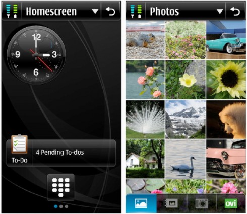
Nokia has been very vocal about the features of the S^4 that seem to overlap with other mobile platform. For instance in its User Interface Concept Proposal (v.2), Nokia compared the S6^4 to the Android. Specifically, the two mobile OS’ movable homescreen. The difference between these two is that Symbian has “independent unique pages” rather than a multi-touch panel screen of most Android phones.
Notable features of the S^4 that we may or may not see in the final release version include – top and botom menu bars that slides offscreen, streamlined menu for contacts, music, photos and applications, support for homescreen widgets, central power/notification menu, consistent UI that will be built in Qt.
Again, all these were based on a concept proposal made publicly available by Nokia. So, we shouldn’t think of those features as final. One thing is for sure, Nokia wants to improve its mobile phone offerings by coming out with a new and improved mobile OS that could bring new mobile experiences for its loyal users.


I’m always excited to visit this blog in the evenings.Please keep on churning out the content. It’s very entertaining.