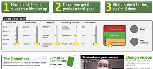
Nokia launched its Design by Community project last week to allow users to vote on which features they would like Nokia to add in the design of their fantasy smartphones. This would allow Nokia some feedback on which designs would appeal to its customers, and perhaps stop people from complaining about the look of their smartphones. The project will continue until the end of May.

This first week focuses on the device’s display and user interface, letting users pick their ideal screen size, keypad, secondary buttons, and the rest. Following weeks include size and shape, materials, operating system, connectivity, and more. Democracy! It worked for America, so why not for your smart phone?
After that, a concept sketch will be voted on and later rendered — but no plans to ever have it made into an actual retail product (boo). We can’t exactly say we understand all the selections here: why is a touchscreen keyboard less ambitious than T9 text entry? Does saying capacitive is more ambitious than resistive serve as a subtle hint of trends to come? What in the world is the difference between hot key and one touch? It’s interesting to see how X6, N900, N97 all come out as a Perfect Mixes, while last year’s E75 and the more recent C5 all straddle the “less than ambitious” line. Oh, and just so we’re clear… a 5-inch, 21:9 ratio display without touchscreen but with a touchscreen keyboard is a perfect mix. Go figure.


