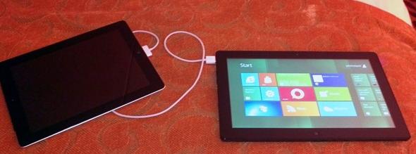
Winrumors has posted a very interesting video of an iPad 2 running iOS 5 compared to a Windows 8 Slate and the video goes over almost every feature that these tablets offer, from lock-screen to social network integration. The certain features like Mail, Calendar and App Store could not be compared between the two as these features are not available yet on the Windows 8 developer preview build…………….
Microsoft’s OS of the future will make its way to a range of devices, but all eyes are on one market in particular tablets and Microsoft is beyond focused on proving that it can compete in the tablet space, which is currently dominated by Apple’s iPad line. With Microsoft unveiling its developer preview of Windows 8 Tablet this week, it was only a matter of time before the inevitable comparisons began to appear and courtesy of WinRumors’ Tom Warren, we’ve a first look at Microsoft’s new mobile operating system pitched with the current daddy of the tablet market, the iPad 2 running iOS 5. The comparison begins with a basic overview of the lock screens, which are quintessentially identical, barring the fact that the Windows version is visually similar to the sort of interface present for years in the desktop version of Windows. The Windows lock screen looks a great deal more polished and up against iOS helps to encapsulate nicely the contrasting ideas between Apple and Microsoft on how things should look. Windows 8 lock screen surely has a huge advantage, because of Windows 8’s ability to run both full fledged desktop OS and Metro-style-Tablet-optimized Start menu, it has roaming user profiles/accounts, something which both iOS and Android OS are currently missing.
Next up is the home screen, arguably the most important page on any smartphone or tablet in terms of looks, functionality, usability and features. iOS shows row upon row of icons, and is outclassed quite significantly by the much talked-about Metro UI and Microsoft’s best effort yet in the design stakes by a country mile. The easily customizable tiles actively stream data and updates in a widget-like fashion, lessening the need for unnecessary navigation as the information is there for all to see. The HTML5 browsing experience appears similar on both devices with Windows 8 also allowing a keyboard split for less intrusive typing. The response from both keyboards are pretty indistinguishable and the settings page comparison has contrasting overtones with iOS allowing for many app-specific changes to be made, whilst the Windows Control Panel follows a similar trend to the desktop Windows CP. This is early Alpha and will probably be subject to modification by the time the v1 reaches the end-user. The comparison shows that the Windows device is more interactive than its iOS counterpart, although this is the case with most others on the market as Android includes the widgets and sidebars currently not present in iOS.
[ttjad keyword=”ipad”]


