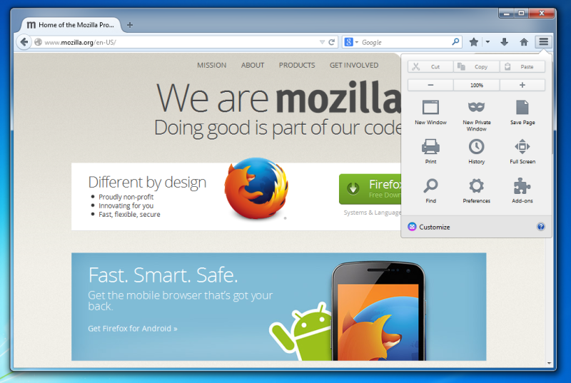
The Mozilla team has been working on a significant Firefox UI update for months. The update is to include the new Australis user interface which has now hit the Aurora release channel. From the looks of it, Australis borrows many design elements from Chrome.
Aurora is the pre-beta channel of all Firefox releases where upcoming versions of the browser are discussed by the community before they are rolled out for a full, public release. Before this, the Australis UI hit the Nightly channel of Firefox, which is the first place where new releases go.The new Australis UI for Forefox, which has been in the works for months, has finally hit Aurora which means that those waiting for it can at least get an early glimpse of the changes.
The first thing you’ll notice about Australis is that it looks a lot like Chrome. The tabs on top of the page are rounded and stacked against each other pretty much like it appears in Google’s Chrome. One minor difference is that when you are using a given tab, all the other tabs kind of fade away so that the currently used tab looks more prominent above the URL bar.
This is helpful in that it lets you quickly identify where your current tab is located. The new Australis design also includes a revamped menu which now comes with many customization options. To access the list of customization options, simply hit the ‘customize’ button in the main menu.
The philosophy behind the Australis UI is to make the design, outlook and usability of Firefox simpler and more intuitive. Firefox has lost some of its pace in recent months but if Australis turns out to be popular, it may help Firefox gain back the momentum.
Source: Mozilla
Courtesy: TechCrunch
[ttjad keyword=”blackberry”]


