Tech analysts have long lamented that email is one part of the internet that has been more or less similar to what it was in early days. It seems that Google is all set to change this with a huge visual overhaul of Gmail that it is currently testing.
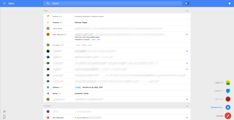
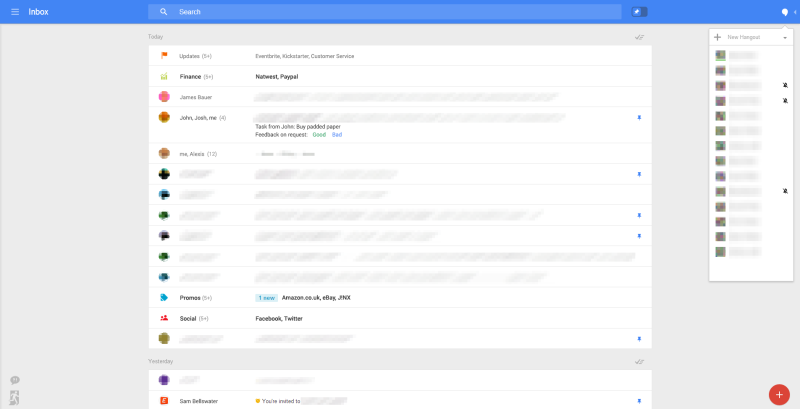
In this interface overhaul, Google has not only changed the very looks of Gmail but also packed it with a whole plethora of new features. In terms of looks, the test version looks really sleek and neat, with all the clutter of buttons and folders moved to the bottom right corner.
The main part of the page, the middle portion, comprises of a simple yet elegant view of the emails. Even key buttons such as ‘Compose’ have been moved to the bottom right corner so that the main interface looks very uncluttered.
The new features that this test version includes are:
- Reminders: so that Gmail will remind you automatically to respond to a given email at a certain date.
- Snooze: it is pretty much the same as postponing an email so that it goes down in your inbox and emerges back to the top of the list on a later date you choose.
- Pins: rather than ‘star’ your emails in the Gmail inbox, you are able to pin emails to the top of the inbox.
- New tabs: alongside the regular tabs, this test version includes new tabs such as Travel, Purchases and Finance
In all, the revamped Gmail looks very promising and seems a lot better than the version of Gmail we use today. However, whether or not Google goes forward with this test version remains to be seen. The company frequently tinkers with new versions and test runs, many of which are never actually implemented. So the fact that Google is testing this version is no guarantee that it may actually be rolled out in the future.
Source: Geek
[ttjad keyword=”android-device”]


