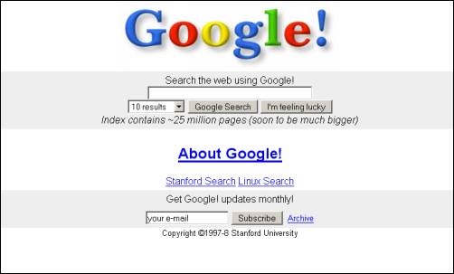
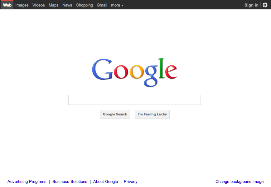
Google has redesigned its homepage, simplifying an already minimalist webpage , you realise it’s a change for the better, but it’s usually a bit of a double-take moment as your once nerdy friend has suddenly scrubbed up rather nicely. Not even the classic Google homepage is safe, but also the search giant reveals its intent to roll out a sweeping series of graphical improvements across Google Search, Google Maps, and Gmail over the next several months…………
You might begin noticing that things look a little different across Google products and Google is working on a project to bring you a new and improved Google experience, and over the next few months, you’ll continue to see more updates to their look and feel. Even Google‘s classic homepage is getting a bit of a makeover:
- Focus: Whether you’re searching, emailing or looking for a map, the only thing you should be concerned about is getting what you want. Google’s job is to provide the tools and features that will get you there quickly and easily. With the design changes in the coming weeks and months, Google bringing forward the stuff that matters to you and getting all the other clutter out of your way. Even simple changes, like using bolder colors for actionable buttons or hiding navigation buttons until they’re actually needed, can help you better focus on only what you need at the moment.
- Elasticity: In the early days, there was pretty much just one way to use Google: on a desktop computer with an average-sized monitor. Over a decade later, all it takes is a look around one’s home or office at the various mobile devices, tablets, high-resolution monitors and TVs to see a plethora of ways to access the web. The new design will soon allow you to seamlessly transition from one device to another and have a consistent visual experience. We aim to bring you this flexibility without sacrificing style or usefulness.
- Effortlessness: Google design philosophy is to combine power with simplicity. They want to keep our look simple and clean, but behind the seemingly simple design, use new technologies like HTML5, WebGL and the latest, fastest browsers to make sure you have all the power of the web behind you.
[ttjad keyword=”general”]


