Mozilla Just start FireFox 3.5 Branch. We already got a preview that its next will be 3.6, which has codename traceMonkey. But few days back we got few MockUps of 3.7. But they are such high ambition and insane workaholic that they also released PreView MockUps of FireFox 4.
(New) Initial Windows Theme Mockups for Firefox 4.0
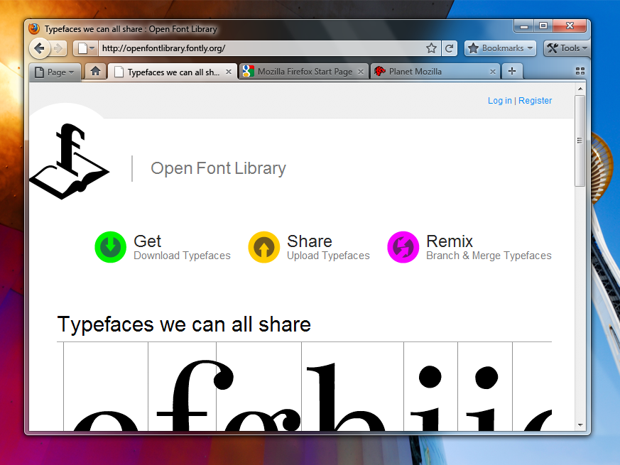
Version A – Tabs-on-Bottom
Possibly add a Bookmarks widget as an upfront replacement for the Bookmarks menu/Bookmarks toolbar (option to turn those on would remain).
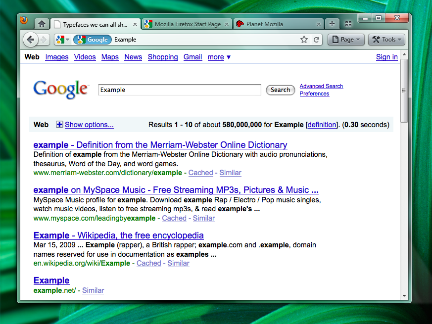
Version B – Tabs-on-Top
The more contentious Tabs-on-Top concept.
Positives
- Save Vertical Space
- Efficiency/Remove Visual Complexity – Right now the tabs have to be connected to something. So we are adding an extra visual element for them to connect to.
- Shorter Mouse Distance to Page Controls
Negatives
- Breaks Consistency/Familiarity – Moving things confuses existing users.
- Title is MIA – With the space removed from the titlebar you only get the truncated version in the tab.
- Longer Mouse Distance to Tabs – Takes longer to mouse to a tab.
- Lost Space – Sandwiched in between the application icon and the window widgets you lose some space.
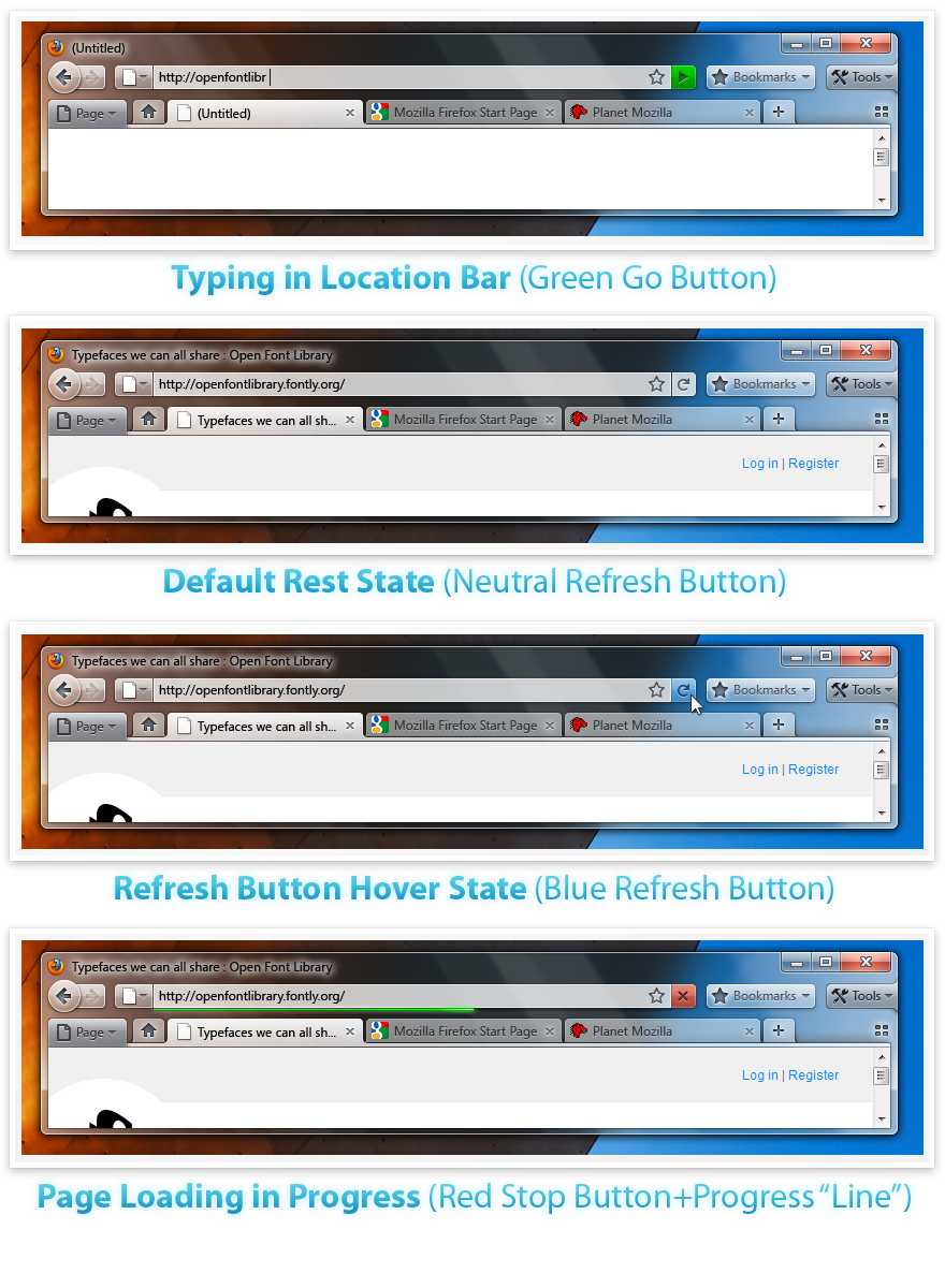
Combo Stop/Refresh/Go Button.
Attached at the end of the location bar.
- Turns green when you start typing.
- Blends with the location bar when at rest.
- Turns blue on hover.
- Turns red when a page is loading.
The proposed iconography is mostly colorless. Adding color to these temporary action driven buttons will make it more obvious something is going on.
Take A Look at 3.7 Preview.
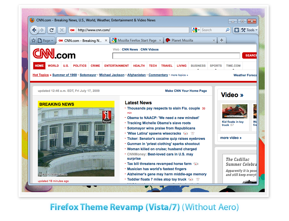
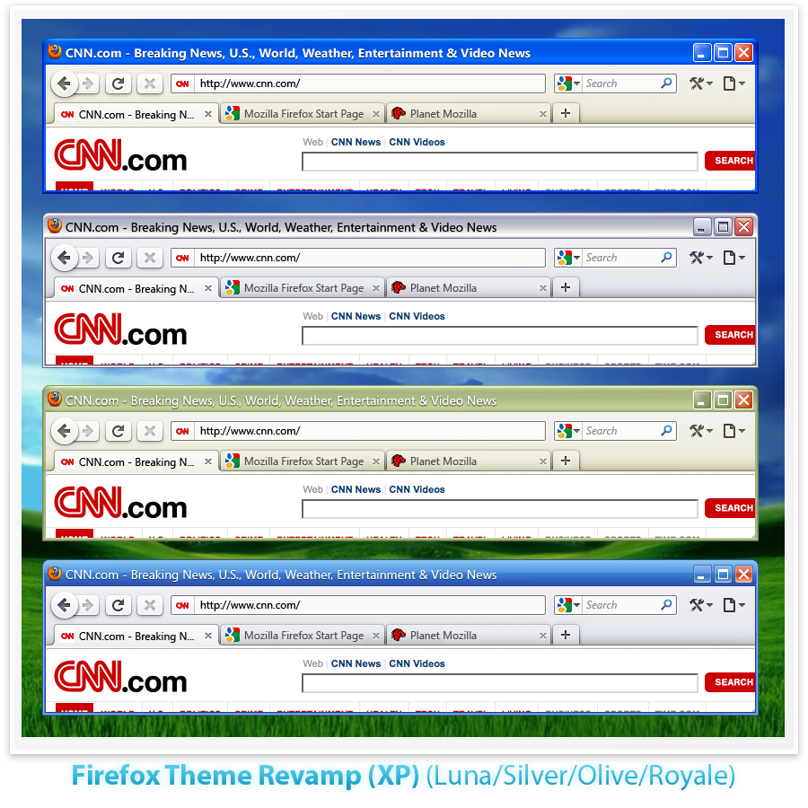
Initial Windows Theme Mockups for Firefox 3.7
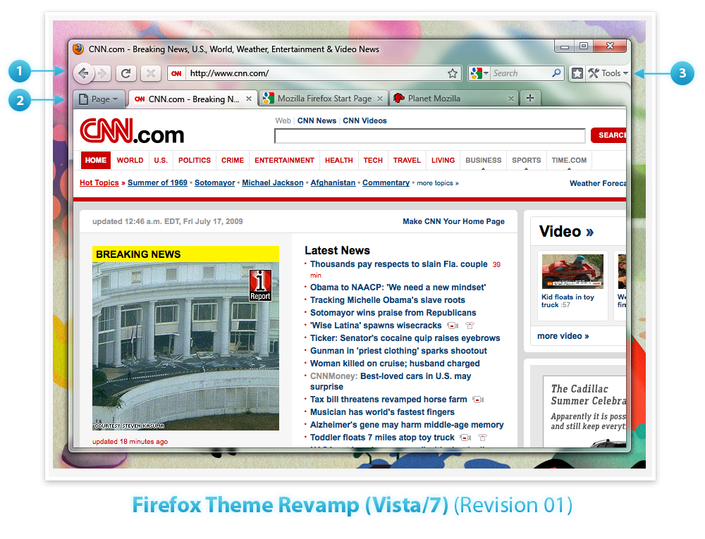
Vista/7
- Embracing Glass: Toolbar and Tabs using Glass. Buttons translucent and slightly glossy to meld with the toolbar. Raised 3D lookachieve tactile “feel”.
- Page Button: Connect the Page button to the left side of the tab area. Directly connected to the Page.
- Tools/Bookmark Bar: Connecting the Tools button to the side of the Window to emphasize the fact that it is used for customizing and changing the UI. Adding a button next to that to toggle the Bookmarks Bar which is turned off by default.
XP
Retrieved from “https://wiki.mozilla.org/Firefox/3.7_Windows_Theme_Mockups“




Hi there,
Onload of page my antivirus put alert, check pls.
Have a nice day
Pett
Looking to know the cost of an iphone 3G 16g phone full price without a contract. Doesn’t need to be unlocked.
________________
unlock iphone 3g
Hi, Whats the difference between 3GS iphone and 3G iphone, if its the connection speed how much faster is the 3GS from the 3G? Also, can you use microsoft words on the iphone, and do you have to buy the apps for it or can you get it for free? Thanks!
________________
unlock iphone 3g
Come on, give me a break! I’m just not buying it. Anyone could make this stuff up – where do you get your information?