A version of Gmail used by Google employees has been revealed in a screenshot included with a Chromium OS bug report, and the image reveals more than a half dozen changes to the Gmail most of us are using today…..
![]()
The blog Google Operating System posted the image yesterday, and we’ve also featured it below. Note that Google Operating System originally posted it as two images — the top bar that says “report issues” and so on was its own image, so we’re not sure how it’s really oriented in relation to the rest of the stuff you see.
Also remember that this internal version of Gmail may differ from future public versions.Savvy Gmail users immediately picked apart the screenshot looking for new features and interesting changes. Most notably, Mail, Contacts and Tasks have all been featured in the top left as the three pillars of the user experience. Right below those, you can see that “Compose Mail” is now an actual button, not just a text link. That’s simply an aesthetic change, but it’s an interesting choice regardless.
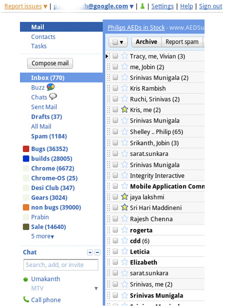
Following that theme, there are no longer text links to actions such as “Select All” or “Select None” — those appear to now exist under a textless drop-down box above the Inbox. Drop-down boxes are ubiquitous in general, actually. Note that the e-mail address at the top menu is accompanied by a drop-down box — could that be the Gmail account switcher that Google promised?
Look in the chat window and you’ll see a new “Call Phone” button. That might be Google Voice integration. You’ll also see two little buttons in the top-right corner of the Google Talk window; one of those could be a rejiggered settings menu, but it’s hard to tell for sure.
Source :mashable.com


