Facebook showed us its redesigned News Feed yesterday. Though report says Facebook started to roll out this new design to web user already (not all at once, serially I think), and its mobile apps will receive update in coming weeks. But after digging more reports it seems this whole update will make Facebook.com look like an hosted app, specially almost like its iPad app. Look at the image below.
If you look at the drawer-style collapse, its more likely to the Facebook mobile Apps, specially iPad apps. Yes, the image and filter is different. But it seems like Facebook wants to give us a similar feeling for both in Mobile and in Web. It feels more suitable for the touch screen though.
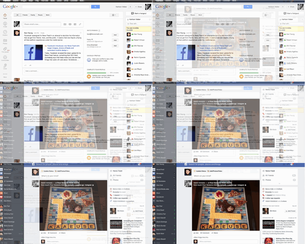
There is been a lot of discussion about this News Feed redesign like always. But most people are saying it will be most dramatic update and changes Facebook ever made in its News Feed since 2006. Similarity and timing of announcement with Google+ is also another discussion. Google+ rolled out a new updates just one day ago. If you read our report, you will get better idea about the change. I wrote another article about this super big cover photo and what to with it in my blog.
You should also check this graphics below to understand Facebook News Feed and Google+ similarity
We still have o wait to see how user feel about this change and how comforting this whole changes is. Please share your thoughts and when you got it enabled in your account dont forget to give us a heads up. And yes you could apply to be in waiting list to be included in the new News Feed roll out list here.
Thanks: TNW


