Iron Man 2 is a design marvel, from the realization of Tony Stark’s suitcase armor to the high-powered, heavy-metal set pieces. We talked to production designer J. Michael Riva and conceptual illustrators Ryan Meinerding and Daren Dochterman about this film.
How did you approach the second Iron Man film differently than the first one? Was there more creative freedom this time around, because the first movie had already done such a great job of translating the visuals of the comics into the big screen?
J. Michael Riva: Well, the answer to that one is simple – there can only be tangible creative freedom when there is an established storyline early on. We all came into Iron Man 2 without one. The entire picture was about catching up to the story which never quite got the attention it deserved. Having said that, the director’s challenge was to try and surpass the fun of the first one, which I think he did. Having set the bar of the moral engine of Tony’s character so high in the first installment, everyone felt they had earned the freedom to let Tony have some fun this time. He gets to party, get drunk and wreck his house, race dangerously in Monaco, fight his best friend and alienate his ‘girl Friday’ and generally act like an asshole throughout – and he justifies all this bad behavior with a storyline detail that his RT is failing. With all the confidence that the show would be a slam dunk successful sequel, there was substantially more freedom to explore the Iron Man world on this 2nd one while they all figured out the story.
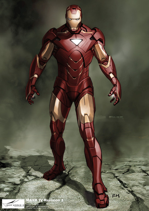
How did you go about making the new Mark VI suit an improvement on the previous suit designs, including the Mark III from the first film?
Meinerding: The Mark VI design is meant to be a bit sleeker than the Mark III. What Adi Granov and Phil Saunders did with the Mark III is so successful and was received so well, though, it became a struggle with how far to deviate from it. It was decided early on that we wouldn’t change the helmet and just try and find a way to make the rest of the suit feel a little bit more advanced. There was talk changing the RT to a triangle shape for the final suit design, and so I was trying to come up with a design that could work with both a triangle and a circle.
In the end, the major changes are in the shoulders and legs. The Mark III legs are very strong but also very linear… they do a great job making Iron Man look like he’s built for flying. In Iron Man 2, though, there was going to be a lot more fist fighting on the ground, and it felt like trying to get a bit more human gesture in the front view of the legs would help with posing. The aim for the shoulders was to reduce the bulk from the Mark III, but through the variations and revisions for the practical vs. digital suits, I don’t think they got a whole lot slimmer. The slightly hunched posture that is iconic to the Mark III is something we definitely didn’t want to lose, and so we ended up taking the shoulders back to that in the end.
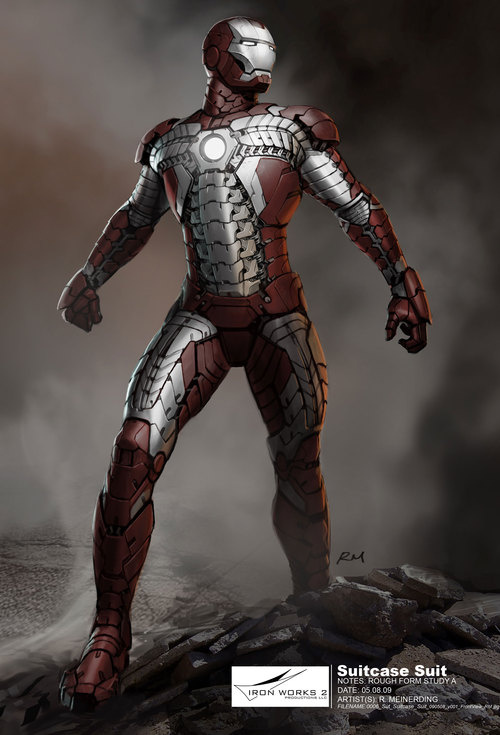
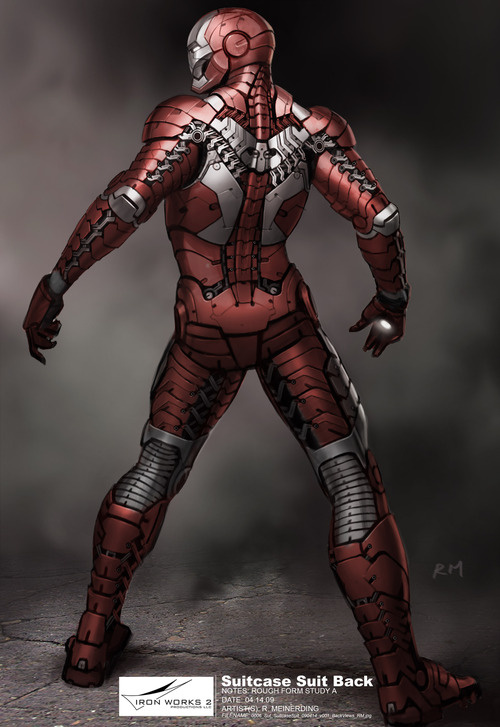
There are a lot of homages to the comics in this new movie, including the color scheme of the suitcase armor which is right out of Bob Layton’s art. Did you spend a lot of time looking at the older comics for some visual references?
Meinerding: Usually the suits we do are inspired by one suit design or another. Marvel does a really good job of giving us a lot of reference, and Jon [Favreau] also is heavily involved with giving comic reference as a starting point. With the suitcase suit, we definitely were looking at some of the classic designs because of how close to the body that armor was supposed to be. Since a lot of the classic designs are really variations on muscle suits, we definitely looked to be inspired there. The difficulty is that if we start with one of the classic silhouettes, we still have to fill it in with tech that feels like it could exist in the real world… and those changes sometimes take it to completely different places. The one specific thing we did take from an earlier design was the color scheme from the Silver Centurion armor. At first we were really concerned with deviating from the red and gold, but in the end that helmet design is so strong that it reads as Iron Man no matter what the colors are.
The biggest departure, from a design standpoint, is the look of Whiplash, who doesn’t look that much like either Whiplash or Crimson Dynamo in the comics. How did you come up with that cool cybernetic harness, with the whips coming off the arms? Were there any real-life inspirations behind that look? What were the functional considerations behind doing it that way instead of going with something more like a suit of armor?
Riva: The story drove this design more than anything else. The whole point of Whiplash in the movie was to prove that someone out there could develop the power source which only Tony thinks he owns. The RT tech is discovered by Whiplash – that’s the important part – not the suit as in the comics. The potential for any armor or any weapon is suddenly out of control and in the hands of Whiplash – an allegorical reference to the present-day proliferation of nuclear weapons. The idea of whips is obvious, and early on Jon Favreau referred all of us to a few guys on the internet who were great with whips. The character is poor and lives in an impoverished apartment room somewhere in Russia – his only resource is his brilliant mind – so he has to make this tech come to life with available stuff, much like Tony did in that Afghan cave. This is why he is so dangerous. He is Tony. So given these parameters, Ryan came up, once again with a terrific design for the whips. Early on we talked about ‘electric plasma’ whips powered by the RT on his chest, and Ryan took all this and ran with it. What you see is what Ryan designed late at night and all those weekends, and ILM made it all come to life, along with a terrific performance by Mickey Rourke who embraced the powers of the suit/design with great enthusiasm.
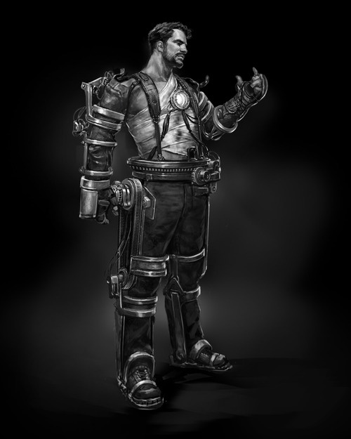
Meinerding: Early on in pre-production, I was given a list of possible bad guys and reference for their designs. At the time, these were supposed to be criminals that were being experimented on with RT tech, so the first designs I did hinted at some of the whip technology being medically implanted into the character. Jon and Marvel seemed to like how this could mirror what happened to Tony in the first film, but thought it could be a little gruesome. But once that connection with Tony’s origin was created, we basically just looked to take themes from the Mark I to develop the Whiplash rig. A lot of that original design was inspired by a telemetry suit we had gotten from Stan Winston Studios (now Legacy Effects) back on Iron Man, and so the Whiplash design is actually derived along those lines.
The functional considerations are really all about movement… and Shane Mahan and the guys at Legacy Effects really figured the specifics of that stuff out. I had incorporated their telemetry suit in the design, and hopefully hinted at an aesthetic that took it into Ivan’s world, and they really figured out how to make all the necessary action work and nailed down the nuts and bolts of the character.
The drones that Justin Hammer and Ivan Vanko build are clearly built on similar technology as Tony Stark’s suits of armor, but they feel somewhat different — maybe a bit cruder. How did you go about designing them to make them seem like they come from the same design universe, but with a different set of creators?
Riva: Justin Hammer, as played by the cool Sam Rockwell, is a crude guy afterall. The suits are thrown together for war- thus the bulkiness. Of course they look like they are from Tony’s world because everyone lusts after Tony’s design, naturally.
Meinerding: When you follow the threads of authorship that are supposed to be in the story, the design fingerprints come from a few different sources. The Hammer drones are meant to be knock offs of Iron Man, and then Ivan takes them and puts his own spin on them. So they should represent Tony in spirit, look less successful than Iron Man, and in the end look like they’ve been reversed engineered by Ivan to be militarized. We tried to make a few of the forms less streamlined than any of Tony’s suits, as well as exposing a bit of the mechanics. In some ways we tried to include obviously bulky forms that really almost feel like they don’t fit, and square off many of the forms. The easiest way for us to make it feel like a copy of Iron Man is to have the light in the center of the chest. The main thing that Ivan is meant to add is the head, and Jon really liked an impersonal, small robot head that makes it clear that there isn’t a human head inside. So with the final product, hopefully, the first read is that they look like rougher Iron Man suits distinctly designed for their branch of the military. Then if you look a bit closer, you could see that the head design feels a bit distinctly different from the rest of the suit… implying the changes that Ivan brought about.
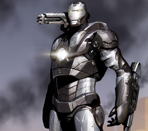
War Machine is such a cool design in the comics, and the movie did a great job of bringing that across. Given that War Machine starts out as a Mark II Iron Man armor and then gets “pimped out,” how much freedom did you have to reimagine his look to make him look different from Iron Man?
Meinerding: The War Machine design process is an interesting one. Phil Saunders had done a version of War Machine during our design phase on Iron Man 1, and when we started on #2, we had that as a great jumping off point. Adi Granov was also developing a different look for the character in some of his comics work, so we really did have a wealth of design to choose from. Adi did some really great work on the character for the movie as well, and in the end we ended up combining a bit from all the different versions. ILM then tricked it out with the really clever mechanical designs for the Gatling gun mechanism and that really finished off the look.
In terms of how much freedom we had, the mandate that it was based on the the Mark II platform kind of came about as we were doing different versions of the suit, and it really just made a lot of sense. So a lot of the design process from there on out was seeing how much of the Mark II we wanted to see, and how much War Machine should feel distinctly different. Any time he ended up feeling like a completely different character, especially with the helmet, we were reined back in a bit by Jon and Marvel. I think they really did want to keep the Iron Man aesthetic pretty tight and not deviate from it too much. In the end, I think the the biggest difference design-wise, besides the color, is bulkiness he has. (Well that, and the huge gun on his shoulder!) It really helps distinguish him a bit from the sleeker Mark VI design. I think if there was too much of the Mark II showing it might be harder to tell the difference between the silhouette of Iron Man and War Machine in those really frenetic fight scenes.
Tony Stark’s house is redesigned extensively for the new movie. How much of that had to do with the requirement of Tony and Rhodey being able to have a knock-down, drag-out fight there?
Daren Dochterman: It was a little give and take both ways, actually… with the new sets being built for the various new scenes in the film dictating where the fight beats were to take place… and the elements of the new sets being tailored to be as interesting as possible for two guys in power suits to bash each other in… A lot of the interior of the house wasn’t really laid out in the first movie, save for the living room, bedroom, and lab… so there was more expansion of ideas here, as to where the gym would go and how the kitchen would connect with the already established spaces. At one point, a lot of the party scene was supposed to occur outside at Tony’s pool, so Mike Riva wanted to revisit that, and I came up with some ideas for it, including one I really liked which was a kind of section of an oval, very much like the Jarvis control… but as a large, “invisible edge” pool… that was the last version I did of it. But as the party scenes evolved, it became more sensible to have them take place inside the house, using the sets that were going to be built… so that’s how that evolved. The pool area remains unchanged from the first film.
How do you feel the design process is different for superhero films versus straightforward action movies? Obviously, you have the comics as a reference point, but are there other things that are different? Like the way you think about action sequences, or the way you build the design language of the movie? Or the settings?
Riva: Let me say that the comics have very little to do with my designs. I think I have referred to them maybe once or twice during all these superhero movies. Literally.
Yes, there is some great art work out there, but when it comes to design, again the story is what drives what I do – always. Obviously, you are working in a more make-believe world, and especially the Stark universe is all about insane amounts of money and power and gadgets-so you have the freedom to do a lot of dreaming and explore many ‘what if’s.’ The possibilities are endless. But all things must be based in some sort of reality. Dick Donner, one of my all time directors I have worked for many times, calls this ‘verisimilitude.’ This is what you want. An unbelievable believability. A world that you live in and accept for that two hours in the dark – you never question it, no matter how fanciful it appears. This state is what all filmmakers strive to achieve and which is the most elusive. It comes from a deep understanding of the importance of that very precise balance between story and the visual narrative- and it’s achievable only when you understand and are humbled by how far you can stretch reality. Sometimes it works and sometimes it doesn’t. But when it does…
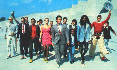
How would you compare designing the world of Tony Stark with that of Buckaroo Banzai?
Riva: Buckaroo Banzai was a study in sheer enthusiasm, and devotion with little or no money! The limitations forced us to do things that ultimately helped us design the film. Thank God I had a great and encouraging director, cast and crew! We were all in it together – a real family of wigged-out professionals. I didn’t have the luxury of a built in audience like the fans of Iron Man, nor the money. We were a small film, with a half-hearted commitment ($) from Fox. Long hours and weekends trying to get a look with few resources. Many times I was foaming spaceships with two-part foam guns, making up shit as I went along. When our hero alien and Buckaroo climb into the small escape pod near the end of the film, the alien says ” It’s an escape pod… but it’s a very bad design!” He wasn’t kidding! Iron Man came with its own challenges, of course. But we had the money to address them – the only impeding us was ever-changing script revisions… Buckaroo Banzai had no such luxury. When we were faced with limitations, we just did our best. Ironically it worked for the aliens who were not supposed to be the most intelligent creatures in the universe. It became a choice, necessitated by time and money and it just so happened to fit with the story line. Things like this happen sometimes. It’s a great business that way. It’s why I love what I do.
Iron Man 2 concept art courtesy of Ryan Meinerding. War Machine concept art from Iron Man, by Phil Saunders. All images copyright Marvel Studios.


The limitations forced us to do things that ultimately helped us design the film.