YouTube is getting a lick of experimental paint in a project named Cosmic Panda, which sees the video sharing site get a black and white look like a panda and the new look is in line with that revolutionary new black bar and cleaner aesthetic that Google is slowly rolling out across Gmail, Google+ and other Google services. Youtube’s new design also offers updated editing tools for personalising your YouTube profile and allows you to keep watching a video while browsing other playlists if you happen to be using Chrome…………
YouTube is currently testing out a sleeker, darker design via its ideas incubator, TestTube and the experiment called Cosmic Panda, which announced Thursday on YouTube’s blog. The experiment is by no means a done deal when it comes to a possible redesign and YouTube will suggest you check out a video, a channel or a playlist. When watching a video, for example, the vid in question will be featured on a black background (instead of white). Suggested videos and comments are now located underneath the video (toggle between them) and related videos are located on the right. YouTube did add the option to easily switch the size of the video in-browser (above related videos), which is a nice supplement. When it comes to channels, the new header is a lot more polished looking. Usually, when you click over to a channel, the featured video starts autoplaying immediately (annoying). With the new version, the header is also a video, but at first glance it appears to just be a graphic. YouTube also rejiggered the setup so all content is found under the tabs Featured, Video and Community and also the whole layout is much cleaner and more professional looking. YouTube pushed its most recent major redesign in January 2010, streamlining video pages and nixing the starred rating system. According to YouTube, it’s all of the following:
- A new experience for watching videos and playlists
- More page designs and better editing tools to customize your channel
- Keep watching when moving between videos, playlists, and channels (Chrome only)
- Stylish new look and feel
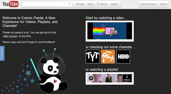
Here’s a look at the Cosmic Panda home page:
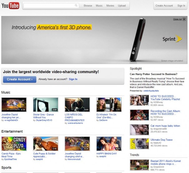
Again, nothing too drastic in terms of look or location.
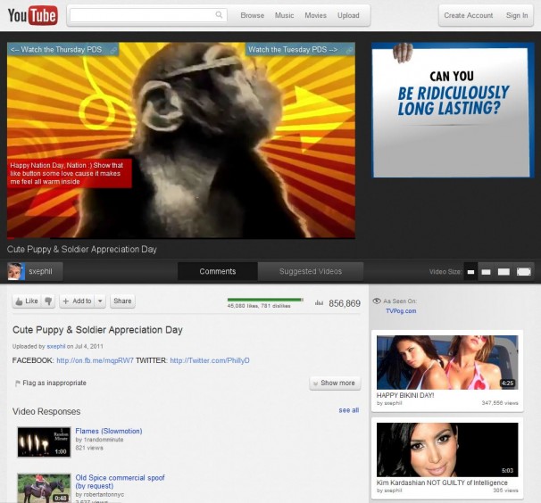
It’s the video player page where you’ll start to see more significant changes:
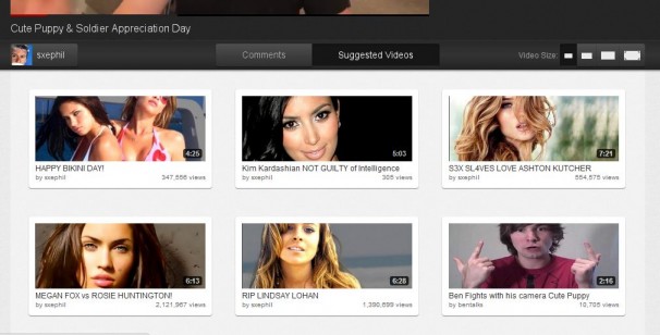
Down below the video, you’ll now see dark toggle buttons for Comments and Suggested Videos. It defaults to Comments view, as usual, but you can click the Suggested Videos button and see this:
Notice the Video Size options in white over on the top right of that screenshot. That’s fantastic. Simple icons for one-click size changes.
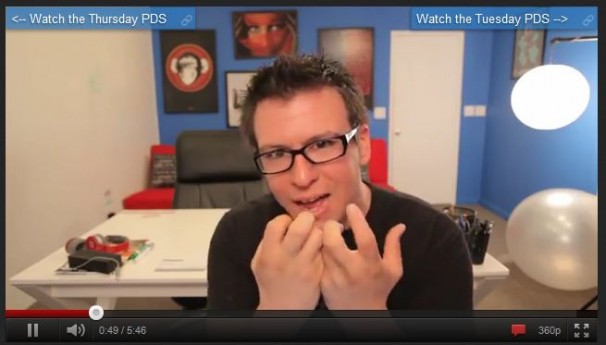
Let’s take a look at the player itself:
This thing is outstanding in my opinion. Simplified and slick. The red chat-balloon icon on the bottom right lets you toggle the video’s annotations on and off, and when captions are present, you’ll have another little toggle icon for turning those on and off as well. And as you can see, you can still change the video resolution or jump up to full-screen view with the click of a mouse.



Much better additive on them and getting the best of the stuff to providing them. Features like all the video album to screen shots are presents and available with which getting best trick to it.
coupon code