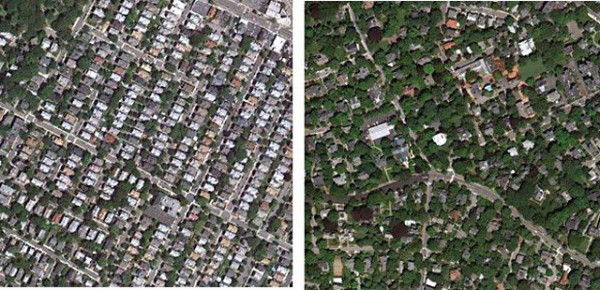
Income inequality is existent in every nook and corner of the world. Analysts try to gauge ways to better measure it and understand it from its characteristics. Now, it has been found out that satellite photos from space can help us understand how different the per capita income of two regions is, when compared to each other.
The photo posted above includes Ball Square in Somerville (the more crowded image) and West Cambridge. It is manifest from the photo above that in Ball Square, the density of built infrastructure, hence population per unit area, is more than West Cambridge. West Cambridge, on the other hand, has less houses and more forest cover.
According to Tim DeChant, a blogger at Per Square Mile, forest cover in urban areas can very accurately depict how economically well off people in that region are. If the per capita income is higher, there will be more trees both at public as well as private property. If the per capita income is low, the reverse will be true. DeChant says, “I was curious, could I actually see income inequality from space? It turned out to be easier than I expected.”
DeChant did a similar research years ago when he gathered data from 210 cities in U.S., trying to discern the patterns for forest cover. He reached the conclusion that for every 1% increase in per capita income, demand for forest cover increased by 1.76%. On the other hand, 1% drop in per capita income resulted in a drop in demand of forest cover by 1.26%.
DeChant says in his report, “It’s the poorer ones that probably need trees the most but are the least able to plant and maintain them.” You can check his entire blog post with images from a number of cities from around the world here.
Source: Per Square Mile
Courtesy: Ubergizmo
[ttjad]


