Google has updated its web app for Gmail with the inclusion of pull down to refresh, new transitions and updated icons to take advantage of the Retina display of the iPhone 4 along with transitions between inbox, menu and conversations look as if one screen is sliding to another. The basic idea behind such transitions is to make the whole process smoother and the new changes have been made via a combination of up to eight different CSS3 transitions and Javascript………….
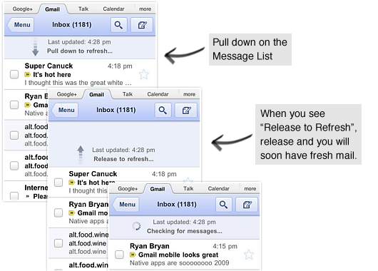
Google has added a few new features for those who don’t have a dedicated app on their handset. While the updates a rather minimal, all are welcomed, as they bring the web app a step closer to that of a native application. Google has now implemented a new way to refresh your inbox, which likely won’t look unfamiliar to iPhone and Android users. Instead of the dedicated refresh button on the corner, Big G has opted that the pull-to-refresh option was in order. The implementation is smart and alleviates the need to dedicate an icon for refreshing your mail. This option is only for all iOS devices and BlackBerry Playbook users, it seems. We can imagine Google left its own mobile OS out since Android phones already have their own, very capable, Gmail application. The other updates for mobile Gmail aren’t nearly as interesting as the new way to refresh your mail, but we’ll take them anyway. Gmail for mobile now features higher resolution icons, as well as new screen transitions when entering or existing an email. The high-resolution icons should appear sharper for those working on a tablet device or high-resolution display on a smartphone, like the iPhone’s Retina display. While transitions may be a bit useless to some, it will just add a little more umph to the web-app, making it appear snappier and more smooth. While there’s nothing groundbreaking about the newest updates, the new tweaks will bring Gmail for mobile closer to that of a native application, while making it a faster and smoother experience as a whole.
What’s New:
- You can now pull down to refresh your message list and conversation on all iOS devices. To refresh, simply touch the message list, drag downwards and release.
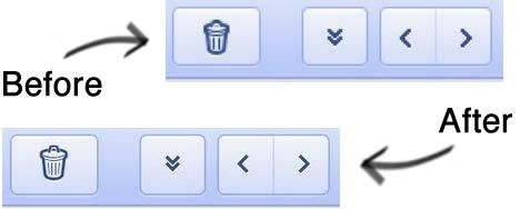
- For those of you using Gmail for mobile on an iPhone 4 Retina display, the icons and graphics are now at a higher resolution, making Gmail for mobile sharper.
- When you tap on a conversation, tap back to the inbox, go to the menu or go back, the view will slide left or right. This new transition animation is a quick, small indication that makes the view change feel smoother.
- Pull down to refresh – Much like any number of iOS social networking apps, just drag down on the screen and release to check your Gmail. This only works on Apple iOS (read: iPhone and iPad) and BlackBerry PlayBook devices, apparently.
- High resolution icons – Apple iPhone 4 users are privvy to new, higher-resolution icons that take advantage of the Retina display.
- Transitions – There’s now an animated slide effect when going between the inbox, conversations, and the menu, to make the whole thing appear smoother.
[ttjad keyword=”iphone”]


