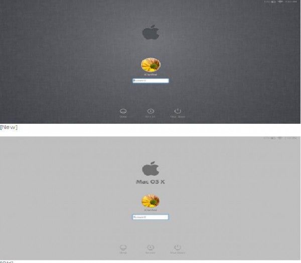
Apple has released the fourth developer preview of the forthcoming OS upgrade, Mac OS X Lion and brought a new linen look to the login screen. It used to be a light grayish feel of the screen which has been now changed to the Dark grey and Apple has included the restart to safari option which lets you reboot directly in the browser, thereby preventing the access to the private date of the user…………..
Apple has made available the first update for the developer preview of Mac OS X 10.7 Lion and the update named simply Lion Developer Preview Update, weighs in at 656.6 MB and also it’s ecommended for all users running Mac OS X Lion Developer Preview 4. Apple has announced that it will be distributing Mac OS X Lion exclusively through the Mac App Store and not in retail packages using optical discs and it is still unclear that the Mac OS X Lion will undergo another preview for developers when the launch is at the other corner. Mac OS X Lion said to be one of the biggest releases of the conference, the OS has 250 new features and is upgradeable right to currently owned Macs over the internet. Some of these new features include:
- Multi-Touch Gestures: With the new OS gestures on the trackpad control of Macs are transformed. Now more natural motions are included to control your every move. The trackpad recognizes different actions for one, two and three fingers. One finger allows you to do the usual moving of a cursor and clicking. With two fingers you can scroll through a page, tap to zoom, and use a pinching motion to zoom in on photos. Three fingers allows you to switch immediately to Mission Control view (description to follow) and swipe between apps.
- Full Screen Apps: Pretty self-explanatory, but nice nonetheless. This feature allows you do switch in and out of full screen mode and switch between apps using the three-finger swipe motion. This has also allowed for more accessible features in many apps.
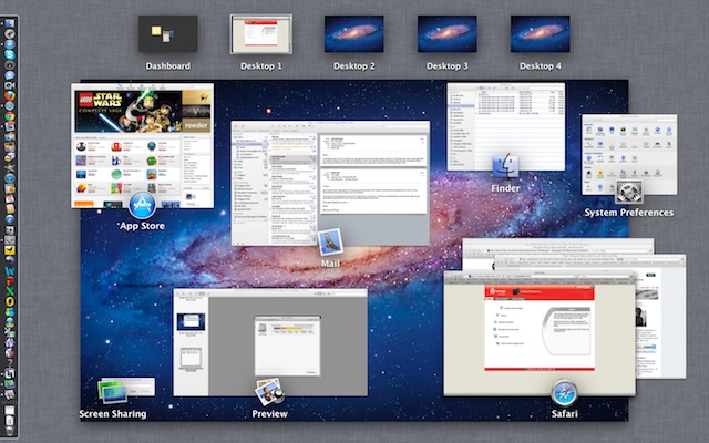
- Mission Control: The “Mac command center” as it is aptly dubbed allows for a whole new navigation experience within the Mac. Once you use the three-finger tap to arrive there, you will find your dashboard in the upper left hand corner followed by all your full-screen apps. Below that are your standard windows and apps along with your desktop.
- AutoSave and Versions: Efficiency is key with this feature. Protecting you from that gut-wrenching “I didn’t save that” feeling, Lion now automatically saves your document so that it can be pulled up again next time you open each app. Don’t worry about starting from scratch once you exit your browser, you’ll find yourself right where you left off. In addition to this, Lion saves a different version of your documents every time you open them and every hour, allowing you to revert back to an original or check your progress.
- Mail: The email feature has been upgraded to a two-column view with a large section for viewing mail and a small one for listing messages. The message list even includes a preview of the first two lines of each email. Search criteria have gotten much smarter while multiple messages between two people can now thankfully be seen in conversation format.
Here’s screenshots of some other new stuff in the update (Build number 11A494A). Lion is shaping up nicely:
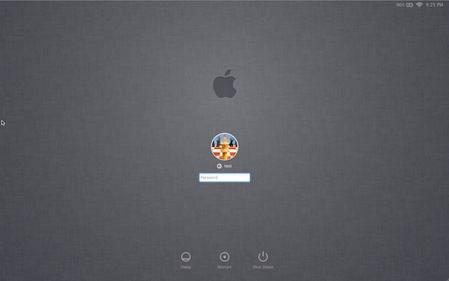
Here’s the login screen again showing a single user account. There’s a small arrow in the password box that brings up the password hint when clicked. Note the battery indicator, WiFi signal strength and time in the upper right corner. Clicking the clock cycles through the computer name, IP address and current build.
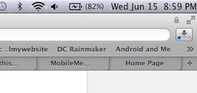
Here is the battery indicator, WiFi and time in more detail. The graphics glitches that plagued the startup screen have now been fixed, according to reports.
The dark linen background is also used in Mission Control. Invoking Mission Control now defaults to an upward three- or four-finger swipe.
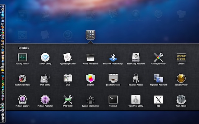
And here is dark linen again, as the folder background in Launchpad.
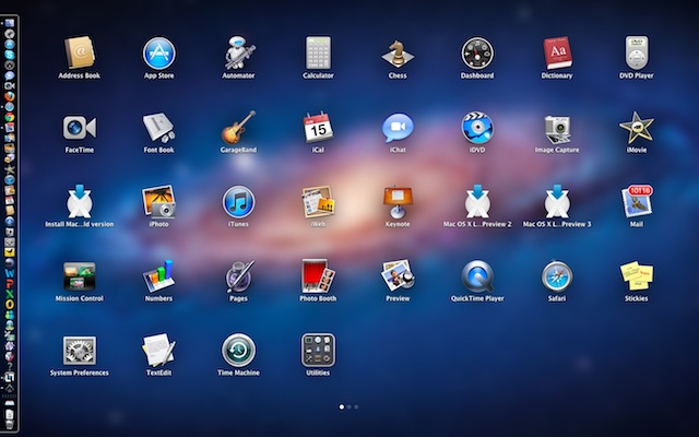
Earlier versions of the Lion beta suffered from missing icons in Launchpad, which has now been fixed.
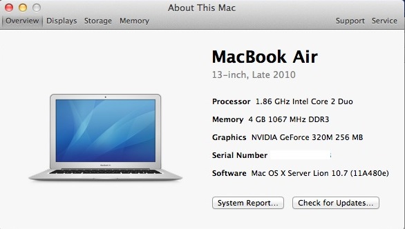
The “About This Mac” box has a slightly modified look. Instead of icons there are now just the words: “Displays,” “Storage,” etc. Here is what the old one looks like.
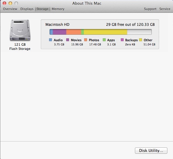
And here is the Storage screen showing current usage of the hard drive (or SSD in this case). There’s a handy link to Disk Utility.
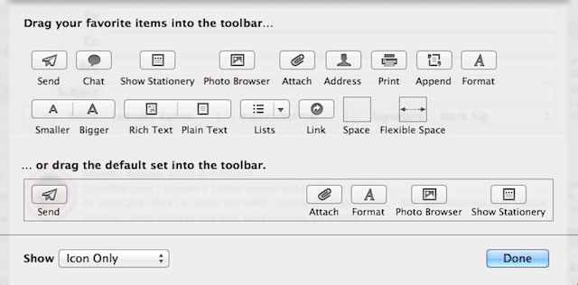
The icons in previous versions of Mail were a little cryptic. A paper airplane to mean send? A new option allows them to show both text and icon. The Mail database has also been updated.
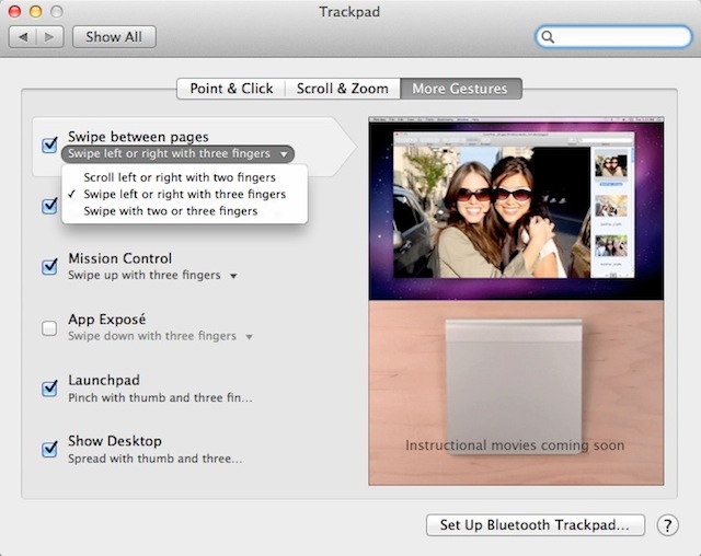
As well as new features, there are new bugs. Two-finger swiping to go back a page in Safari no longer works. However, there is a workaround: Go to System Preferences>Trackpad>More Gestures. Hit the “Swipe between pages” menu and select “Swipe left or right with three fingers.” Voila — it works!
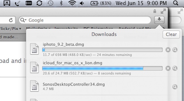
This may not be new but I just noticed it. The Downloads button in Safari includes a blue status bar.
And here is what the Downloads drop-down looks like.
[ttjad keyword=”mac”]


“The icons in previous versions of Mail were a little cryptic. A paper airplane to mean send?” — As can be seen in the screenshot, there’s still a paper airplane icon to mean send in Mail 5.0 (Lion version).
Or do you mean that the icons are still cryptic in the latest Lion build, but are made less cryptic by text shown below them? I don’t know, your article is a little cryptic at this point.
Does anybody know how to get your name off the toolbar? Very annoying.
Toolbar? If you mean the menu bar, open up System Preferences, then go to “Users & Groups”, then “Login Options” and uncheck “Show fast user switching menu as …”.
does anyone know if we could skip this login screen of Lion?
It seems that users who are not carefull when editing or removing accounts can lock themselves out by ending up with a login window (or screen) that will not provide a password prompt. No amount of clicking will help.
I have a friend in that very situation. We tried a reinstall and that did not help. So much for shaping up nicely.
I tried a not many products from Tillmans Tranquils – [url=https://www.tillmanstranquils.com/collections/gummies ]cbd gummies[/url] and actually liked the entire experience. The gummies contain a deplete b empty leaning, smooth surface, and accordant quality. The flavors feel natural, and the portioned servings up it easy to prefer what works in behalf of you. Their packaging looks premium and the total feels thoughtfully made. A unshakeable brand with products that are enjoyable and reliable.
I tried a few products from Tillmans Tranquils – [url=https://www.tillmanstranquils.com/products/indica-gummies ]best indica gummies[/url] and unqualifiedly liked the inclusive experience. The gummies contain a straighten up know, undisturbed surface, and dependable quality. The flavors feel consequent, and the portioned servings up it unreserved to choose what works in behalf of you. Their packaging looks premium and the whole kit feels thoughtfully made. A downright mark with products that are enjoyable and reliable.
I tried a few products from Tillmans Tranquils – https://www.tillmanstranquils.com/products/cbd-thc-gummies-for-sleep and in reality liked the overall experience. The gummies contain a cleansed leaning, undisturbed surface, and accordant quality. The flavors perceive fundamental, and the portioned servings make it unreserved to prefer what works in behalf of you. Their packaging looks premium and the whole kit feels thoughtfully made. A unshakeable brand with products that are enjoyable and reliable.
armed forces|putting into play} and sybaritic payments in an individual place. Extraordinarily recommended!
The Current Casino portion here https://mejoresnuevoscasinosonline.com/ is beyond one of the a-one I’ve seen. The dealers are demonstrative and maven, and the small talk quirk adds a accurate community take advantage of land to the in one piece experience. It feels much closer to being in a verifiable casino than unbiased clicking buttons on a screen. Technically, the stream not at any time buffers, which is crucial in return games like Blackjack or Roulette. Payouts are indecorous, and the promote side is in point of fact considerate if you have questions there the table limits.