Imerj is a Silicon Valley team developing the industry’s most innovative mobile devices. This is a wanderful creation of prototype dual-screened 2-in-1 Android Smartpad. It’s a little tablet, two screens forming one 6-inch slate bisected by a few millimeters of bezel. My friend Tim Stevens has officially reviewed this device for engadget. Let’s checkout his findings bellow.
The software customizations built over Android 2.3, the bezel gestures, the proper multitasking, all make this into a unique device that feels incredibly familiar yet altogether different. It’s a prototype device from Imerj and Frog (formerly known as Frog Design) something that’s months away from production and hasn’t even been blessed with a model designation more specific than “2-in-1 smartpad.”
First impression is one of heft and solidity. Each half of the device feels firm, dense, and the simple hinge in the middle doesn’t click or give any sort of protestations at all as you fold or unfold the thing. When doubled over the two halves subtly pop together thanks to the wonders of magnets, but other than that it’s a smooth trip out to fully extended. There’s no mechanical assistance here.
Compared to the Echo, the hinge is simple and the device just folds in half. It’s a little like opening a book backwards, which is unintuitive at first but ultimately feels reasonably natural. Want a simple phone? Give it a little fold and the second screen is disabled. Or, when you want to use it like a tablet, just grab it and pull the halves flat. If the device is locked it’ll immediately pop to life when unfurled, bypassing the unlock screen and getting you right back to where you want to be.

When extended the device is actually quite thin — just 7mm (.28-inches), and without any unsightly bulges or protrusions. When folded in half it’s still thinner than the thickest extent of the Droid Charge, for example, or about 50 percent thicker than an iPhone 4. Unfolded, it’s about the thinnest smartphone we’ve ever seen, and if you compare it to the spate of tablets it bests even the Galaxy Tab 10.1 by about a millimeter.
So it’s impressively svelte, and for such an early device it’s impressively constructed. The exterior is covered in what looks to be a thick coating of metallic paint that gives a classy look and a cool, smooth feel. Of course, half of it is covered in glass, not paint, and that’s naturally of the Gorilla variety, edges mostly tucked behind the lip of the case.
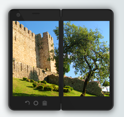
Unfold the device and those two panes meet in the middle, sadly still divided by a couple millimeters of bezel on either side. It’s an unfortunate gap inside what is otherwise a generously sized 6-inch unified display, and we’re told this is about as good as we’re going to get until foldable OLEDs come into play.
There’s a lot of minimalist design going on here, with the subtly swoopy beveled edges interrupted by three buttons all on the upper left: power, volume rocker, and silence. On the far right edge (when opened) is a 3.5mm headphone jack, a little door hiding a SIM card, and a big, flat proprietary connector in the middle that could easily be mistaken for something with an Apple or a Samsung logo on it.
Displays:
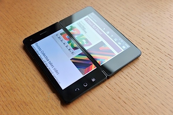
As smartphone users crave more screen real estate smartphone displays keep getting bigger and our pockets keep getting tighter. The solution here is, of course, to offer two rather more moderate-sized displays and combine them into an all-conquering mega-display. Each half is 4-inches of WVGA AMOLED, for a combined resolution of 800 x 960 and a combined diagonal of about 6-inches.
If we had to guess we’d say these are the same Samsung AMOLED panels found earlier in the Focus, which have some issues with color representation and in this deployment get increasingly cool the further off-axis your viewing angle becomes. Still, images are bright and vibrant.
Internals:
Powering the works is a dual-core TI OMAP processor that will be running at an as of yet undisclosed speed, pending final discussions between TI and Imerj. But, expect it to be comparable to your average superphone (i.e. in the gigahertz range). There’s 1GB of DDR3 RAM available for the hardware, while this model has 32GB of internal storage, which is not expandable via microSD. We’re told models will be available with as much as 128GB of breathing room, which should give you an idea of the sort of premium market this device is targeting.
Performance in this prototype seems good but falls short of great. There’s a good amount of lag here and there as you move between landscape and portrait, but of course we’re dealing with a prototype; there’s a long way to go before the software is final. That said, apps launch quickly and are smooth to work with.
A 1,750mAh battery gives it juice. It’s neither user-accessible nor replaceable, but we expect that battery life should be comparable to other phones — so long as you don’t spend too much time in dual-screen mode, anyway. We weren’t able to perform any proper battery life testing and, really, the hardware is too early to draw any conclusions there. But, we’re told to expect longevity that will at least trump the Atrix.
Speaking of AT&T’s hottest hunk of Android, this device is running on that provider’s waves at the moment. Naturally nobody would commit to talk of which carrier would be carrying this device when it launches, it would seem that one or the other half of the proposed AT&T&T family would be a safe bet.
Software:
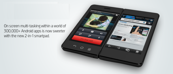
Android supports comprehensive multitasking, letting you pop from Google Music to Angry Birds and back again with a few long-presses of the home button. But, this device takes that concept to a new level entirely. Launch an app and it’ll pop up on the one screen, leaving the other alone. But, with a quick swipe across the top of the bezel that app can hop from one display to the other. Now you can play Angry Birds and keep an eye on your playlist at the same time. If you want to swap their positions you can just pinch up on the upper bezel and your apps will do a little Kriss Kross impression.
A long press of the illuminated circular home button brings up a view of the running apps, which you can simply drag and throw to either of the displays. But, of course, that’s only half the story: with this much real estate you’ll want to be doing some full-screen app tapping, and you can — sometimes.
Unfortunately there’s no “tablet mode” like on the Echo to be found here, meaning that apps need to be modified to run in full-screen. It’s a simple modification that we’re told requires developers only make a little manifest tweak, but as of now only a few apps have received said tweak, highlighted by a little dual-screen superscript on their icon.
Thankfully the web browser here has been suitably augmented, and full-screen surfing is definitely a pleasant experience, as even high resolution mobile displays often leave us wanting. However, we found ourselves most impressed by the customized versions of ThinkFree Office Mobile, which enable dual-screen viewing and editing of Word, PowerPoint, and Excel documents, plus PDF viewing to boot. Tapping your way through a grid in a spreadsheet is never an enjoyable experience, but having it spread across two screens certainly beats squinting at one.
To make a compatible app go full screen you again can reach for the upper bezel. A slow drag across will expand the app from one screen to both, which is an intuitive gesture but one that we wish we could be made on the bottom as well. (Sometimes getting up to the top is a bit of a stretch.) Or, you can simply tilt the phone so that the app you want to go full-screen is up on top. It’ll then fall down to take over the lower screen. To switch back to the other app, just rotate the phone the other way. Nice.
The custom e-mail application installed here also makes good use of both screens. The left display gives you a folder view or a list of individual e-mails, while the right screen can be used to show the e-mails themselves. The only problem? It isn’t the actual Gmail app — just like on the Echo.
A custom, full-screen keyboard is on offer that takes over the lower screen — which is a bit of a bother if the text you want to enter is also on the lower screen. But, this gives it plenty of room for not only a full QWERTY layout but even a row of number keys that can be swiped from one side to the other, exposing a row of special characters or a row of other common buttons.
Camera:
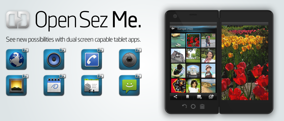
Most modern smartphones have sprouted second cameras: a high-res version around the back and a second, lower-quality option that’s lookin’ back at ya. This device does away with that for the obvious reason that the back sort of is the front — at least some of the time. There’s a five megapixel shooter situated just to the left of the earpiece. When folded, launch the camera app and you get a simple message: “Turn Phone over.” Now the back is your viewfinder and you use it to take pictures. Want a self portrait? Just hit the button, obey the instructions, and now you have a full-sized view of yourself — and a full-res profile picture.
We won’t bother giving detailed camera impressions at this point because there’s some issue with the sensor causing some bizarro chromatic fluctuations in the resulting stills. It’s like a trippy Instragram effect that you can’t turn off. Video, meanwhile, is captured at 720p — or will be. We couldn’t get this one to record so much as a frame of footage.
Wrap-up:
Can a Phone with No Name revolutionize the industry? We wouldn’t go that far, but we’re suitably intrigued. For not much extra thickness and a modest amount of extra heft you wind up with twice the screen size and, if indeed that 128GB model comes to pass, about four times the storage capacity of your average superphone of today. The question is, of course, how much will it cost, and given the premium construction and hardware, we can say with confidence that this will not be a Free After Rebate device.
And then there’s the software. Without the ability to natively run Android apps full-screen, a good amount of developer support is going to be required to make this thing really shine. Developers won’t be inclined to support it without a lot of sales… which won’t happen without the developer support. You know how it goes. But, if going full-screen really does require just diddling a line in a manifest file, we’re thinking most devs will throw that in to the “why not?” category.
And, of course, there’s the question of what to call the thing. We can’t help getting a Clint Eastwood vibe here, and sticking with his most famous character’s Italian Spaghetti Western roots, we kind of like Senza Nome. For now, anyway, until we figure out exactly which company will be bringing this thing to market.
Checkout the official promo video bellow-
Source
[ttjad keyword=”android-device”]

Hi. I am from Imerj. You should hear what users are saying after having access to the new 2-in-1 smartpad:
http://www.youtube.com/watch?v=BdIsGSCvzGc
Please visit us at http://www.imerjdesign.com.