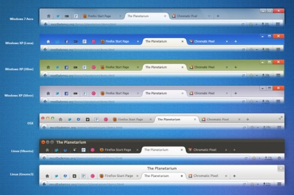
Mozilla team has a knack of giving us sneak peek of its upcoming browser version in advance. Although currently, even Firefox 22 is in Beta state, Mozilla has showed off some major design changes that it will be packing in Firefox 25.
From the looks of it, Firefox 25 looks a lot similar to Google Chrome in terms of certain features. For instance, currently, the tabs on Firefox are clunky and obsolete-looking, being presented as rectangles stacked next to each other.
However, in Firefox 25, this would be changed. Mozilla team will be rehashing the overall look of the tabs so that they will carry the curved looks that have become a prominent feature on Chrome. At the same time, we will finally see a change in the position of menu on Firefox.
Conventionally, Firefox features a drop-down menu on the left side of the window. But with Firefox 25, the menu will be shifted to the right side of the window. Again, this seems to reflect the positioning of menu in Google Chrome.
Among the major design changes that are expected to be a part of Firefox 25, are the following:
- Curved tabs.
- Remove tab affordance from background tabs.
- Separate Bookmark Star from locationBar and merge with Bookmarks Menu item.
- Updated Panel Based Application Menu and Customization Mode.
- Windows (All): Draw entire window frame including Caption Buttons.
- Windows XP: Custom window frame style for all default themes.
The Mozilla team essentially aims to overhaul the entire ‘user interface’ of the browser in the upcoming version. Moreover, the new design will be consistent across different platforms. Firefox 25 is slated for an October release, so we will have to wait until then to lay our hands on an all-new, redesigned and better-looking Firefox.
Courtesy: The Next Web
[ttjad keyword=”android-device”]


