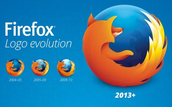
The Mozilla Firefox logo which includes both its friendly orange fox and its Beta channel browser, is one of the more recognizable logos around the world. At different times, Mozilla team has made subtle changes in the logo since the browser was first released back in 2002. However, yesterday Mozilla unveiled the fourth Firefox logo, a (slightly) less textured and glossy icon for its favored web browser.
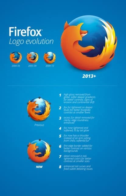
In this new logo, the high gloss from the globe has been reduced considerably in favor of subtle gradient. The fox also loses the pronounced streaks on the back for a less detailed deep orange surface.
There are some other minor changes as well, such as a cleaner tail section for the fox, reflection of the light on the fox’s nose, redesigning of the continents on the globe and for once, a proper shoulder for the arm so it doesn’t look like it’s jutting out from the chest.
The new logo remains as recognizable as the previous one but the redesign breathes new life into it and makes it more relevant in modern times.
Source: Mozilla (Blog)
[ttjad keyword=”android-phone”]


Subtle, but definitely improvements.
Just couldn’t bring yourselves to go full flat with everybody else huh?
That’s good, glad Mozilla isn’t following every trend and fad out there…