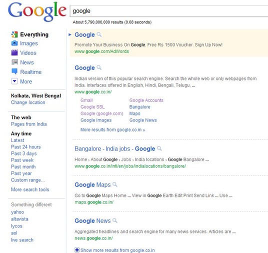
Google has decided to change their search result page design and they already has made new design and it is steel testing.New design is running but it is being shown only for some special region and special person, they added a small tweak to Adsense ads, showing the Advertiser URL on mouse hover.Then there is the famous and much talked about Panda algorithmic tweak which is geared towards removing low quality sites from search results, a redesign of Google search result pages is on it’s way…………
Google is releasing a new look-and-feel for its search results, a three column design that provides a permanent menu of search options and tools to help searchers refine their queries. Google also gains a freshly-updated logo along the way.The new user interface UI for the tech crowd places search options into a column on the left-hand side of the search results page.Search results themselves appear in the middle, in a wider column. Ads appear in the right column, though some ads continue to appear in the middle column above editorial picks:
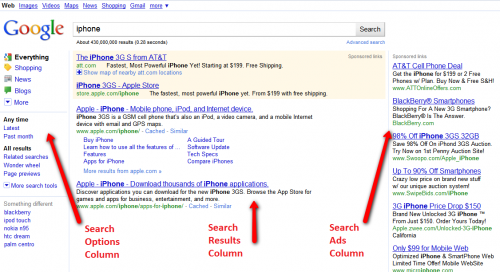
The new look is colorful yet clean and not distracting. It should make it easier for searchers to drill-down further into their queries. Having personally tested it in the past, when I’ve been included in Google’s trial tests like many others picked randomly. It rolls out today worldwide in 26 languages. Google tells me that by the end of the day, everyone should see the new look.Many of the options in the new left-hand search options column aren’t new. Google made many of these features available a year ago and then expanded them last October (see Up Close With Google Search Options). However, in order to find the options, you had to open up the search options column that by default was left off. Today’s change opens up the column permanently, which should cause many more people to make use of these.
The move to a permanently three-column design sees Google following in the footsteps of Ask.com, which pioneered the look back in 2007. Bing and Yahoo followed the three pane trend in 2009, and now it has effectively been given the stamp of approval by search giant Google itself.Below, a closer look at the new design and options, followed by some history and background. The new search options column (or left panel, as Google calls it internally) is devoted to ways for people to refine their searches:

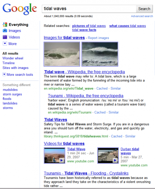
The top portion lists content types, that is, the types of content that a search can be narrowed to. For example, in the search below for tidal waves, you can see that the results contain things like web pages, images and video matches, all blended together in the same column as part of Google’s Universal Search system:
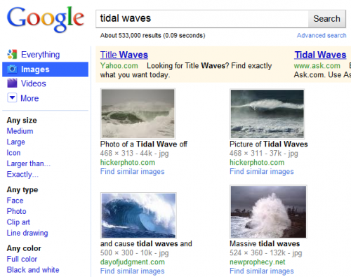
That the default Everything search — where Google is mixing together everything it believes is relevant to your query, regardless of the exact content. What if you’d like only images of tidal waves? That’s where the colorful content type choices come in. Select Images and that content type gets highlighted in blue, to indicate that the results to the right have now been filtered to show only image matches (along with, oddly, two ads from Google rivals Yahoo and Ask both hoping to catch some Google searchers):
Similarly, select the Videos option, and now only matching videos are shown:
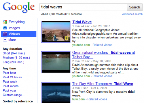
Exactly which content type options appear depend on the actual query. Google says it automatically tries to highlight the most relevant filtering that people may want, based on the content that it finds for a search.For example, the tidal wave search above features options to narrow by Images and Videos. But a search for iPhone provides provides different narrowing options:
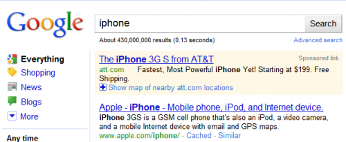
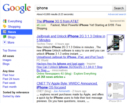
Now the choices are to narrow by Shopping, News and Blog content. The assumption is that people searching for iPhone information may be most interested in these categories of results, while those searching for tidal waves may be more interested in images or videos. As before, selecting one of these other options narrows to the particular content type, such as how choosing News brings back only news content about the iPhone:
Not happy with the content choices that Google features by default? That’s where the “More” option at the end of the list comes in. Select that, and you can see all available options:
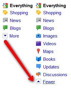
Google only shows content types for the search engines it automatically checks for any query and Google’s Universal Search system automatically checks places like Google Images and Google Books for matches.To further confuse matters, Google also has a few specialized search tools that DO automatically get checked for any query, such as Google Music, Google Health, movie times and more. However, you can’t narrow results to these. These results only show within special OneBox units.If you’ve made it through digesting the new content types in the search options column, there’s more fun in store midway down, in the search tools section. This allows you to narrow results within a content type by time or by other relevant filters.As with content types, what appears by default will depend on the type of query issued. For example, for volcanic ash:

Latest is shown as a time filtering option, which makes sense given that many people may seek the latest results on this breaking news topic.In contrast, consider these filtering choices for iPad:
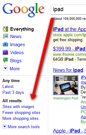
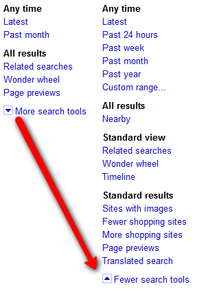
Latest returns as a time filter, along with “Past 3 Days.” But more interesting are the Fewer shopping sites and More shopping sites options. Again, these make sense. For this query, Google can safely assume many people might be interested in shopping info about the iPad. However, a good chunk of people might also want more informational pages about the iPad — hence a handy ability to deshoppify the results.As with content types, if you’re not happy with the default search tools picks that Google makes, you can use the “More search tools” option to see a full range. Here’s what you get doing that from an “Everything” search:
Time Filtering
The first set of tools involve filtering by time narrowing to “Latest” results, past 24 hours, past week, month, year or even a custom date range, complete with pop-up calendar picker:
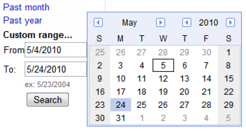
Occasionally, I’ve also seen other options appear, such as “Past 2 months” or “Past 3 days,” as noted above.
While time filtering sounds great, my experience over the years has been that search engines, including Google, often get the dates wrong on pages for a variety of reasons. For a deeper drill-down on these issues, see these past articles:
- Up Close With Google Search Options
- Finding Search Engine Freshness & Crawl Dates
If you select a date option, by default results will be sorted by relevance within that date period. For instance:
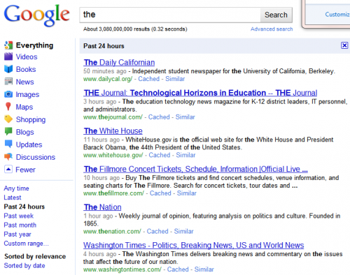
Above, I did a search for the word the, narrowed to the past 24 hours. I like this search because it points out one issue with date filtering. Notice the White House home page is third on the list, with a time of 11 hours ago. That’s not the time the page was first authored — the White House has been online much longer than that! It might be the time when Google last noticed a change was made to the page. It could also simply be the last time Google visited the page. Such are the issues when filtering by date.Mainly, however, notice that the pages are not listed in chronological order. Some “fresher” pages appear below older ones. That’s because the default sort is by relevancy. However, select the “Sorted by date” option, and this changes: 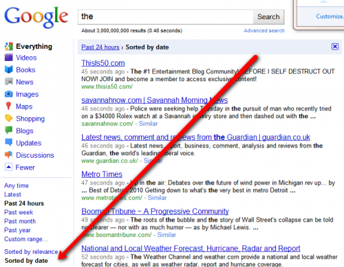
Another option is the ability to filter results to those near your location — at least the location Google assumes you’re at, which it determines by the internet address (IP address) reported by your internet service provider, company, school or organization.Nearby filtering sounds great. For example, a seach for topics such as bicycle rentals or zoos or moving companies when toggled to “nearby” should bring back results relevant to your particular location.What is new in new design:
- Result title font size has been increased
- Distance between two result is higher than old version
- Snippets (descriptions) are shown in one line, maximum two lines.
- Real time contents get priorities, for that reason twitter is being come top
- Overall look is fresher than previous
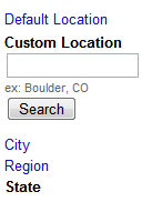
The nearby options are shown below. When selected, you can further refine “nearby” to mean at your city, region or state level as well as entering a custom location, if Google’s not detecting your area correctly:
View Options
Further down, there are three alternative “views” you can apply to your results other than the default “standard” view:

Related Searches puts a list of queries related to your original search at the top of the search results:

Timeline tries to build a timeline of interesting facts related to your query, by exacting information about the subject that’s associated with particular dates on web pages. You get a chart and facts listed in chronological order:

Wonder Wheel is a visual refinement tool, which allows you click your way through related topics as they emanate out like spokes on a wheel. Each click to a new topic causes the results shown alongside the current “wheel” to change:
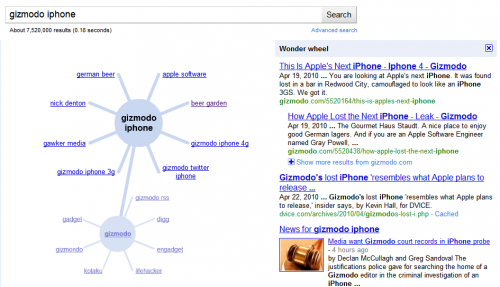
See also The Google Wonder Wheel & Other Search Refinement Features Get Live Test for more about using the tool.
More Filtering Options
After the view options are additional ways to filter your results, some of which really belong either as additional view options or content type options, in my opinion. The options:
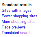
Sites With Images gives you what’s promised — web sites that also have images. Since most web sites have images, it’s hard to imagine this being that useful. But if you really want to read something and want pictures to go with it, maybe it’s worth a try. Here’s an example of what you get:
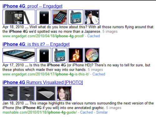
Fewer Shopping Sites / More Shopping Sites feels a lot like the Nearby option — it makes slight changes to the results that can be hard to notice. The main thing is that if you don’t like getting a Google Shopping one box unit like this in your results:
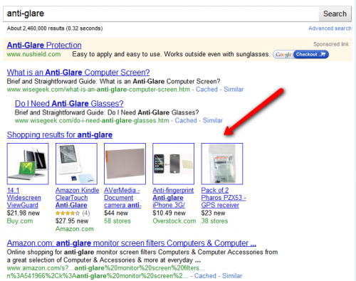
Then using the Fewer option makes it disappear: 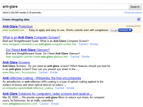 Using the More Shopping option also makes it appear. But if you’re really after shopping results, it makes more sense to use the Shopping content type option.Page Previews will insert little thumbnail images of pages listed in the results:
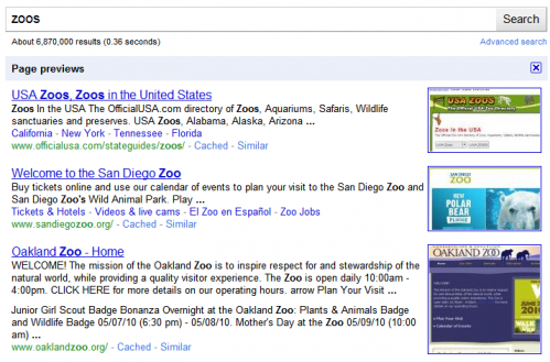
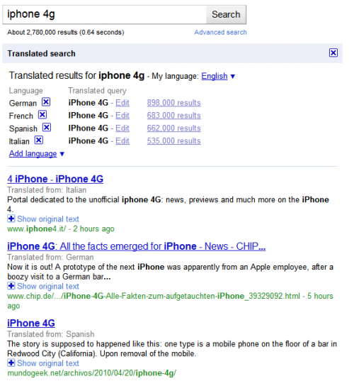
Translated Search is kind of neat. It shows results that are not in your native language (as detected by your browser) and translates them into your language.
Something Different
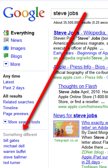
Finally, the last portion of the search options column is called “Something Different.” It’s meant to suggest other queries that are related to your original one. For example, for Steve Jobs, people like Bill Gates or Michael Dell are suggested:
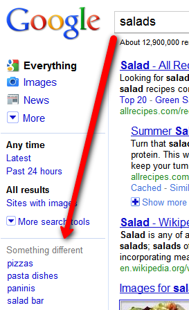
For a generic term like salads, you get items like pizza or salad bar suggested:
Somewhat related to this is a new feature that came out last week, “Pages Similar To” — not to mention a long-standing feature, “Searches related to.” Both are shown below, in how they appear at the bottom of the search results for best buy:
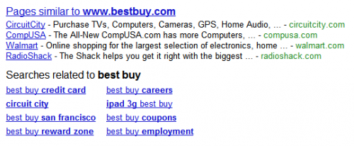
You can see how Google suggest related pages — which really are related companies like CircuitCity or Walmart. That can be handy for searchers, though it probably drives some brand holders crazy that Google’s recommended their competition (similar to how it does this on Places pages in Google Maps). Below this come suggested searches.
Bottom Redesign
As long as we’re at the bottom of the search results, it’s also worth noting they’ve gotten a facelift as part of the new look and have been cleaned up. The old: 
and the new:

Specific Search Tools For Specific Content Types
When I covered search tools above, I looked at what appeared in response to an “Everything” search. However, when you drill into particular areas, the Search Tools may change — sometimes dramatically so.For example, in a search for iPhone narrowed to Images, you get new options designed to let you narrow by size, type (face, photo, clip art, line drawing) or by color:

Narrowing to video brings up video-related options such as length of clip, time it was published, video quality, use of closed captioning and source of clip:

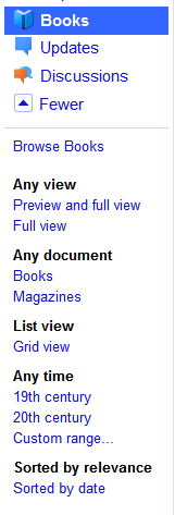
Filtering to books allows options to find books that are “full view” (you can read them in their entirety), to filter to magazines, to see results in a grid display and even filtering time …. by century!
Selecting discussion allows for special filtering such as discussions on forums versus Q&A sites as well as “short” versus “medium” and “long” discussions:

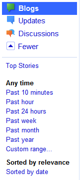
For blogs, there are short time options, such as 10 minutes or the past hour:
For news, there are options to see “all news” versus news images or news from blogs:

If I click to filter to news content from blogs, I also get specialized time filtering options, such as over the past hour or for particular years, 2007, 2008 and so on:

Also notice how the colorful content type bars have suddenly disappeared. That second drill-down kicked me over into Google News itself, rather than the main Google.com site and the new UI didn’t carry through there.Things like that also happen if you use either the Shopping or Maps areas. Drilling into these bring up specific options but not keeping the look-and-feel of the new left column. Shopping looks like this:

You can see that once you go into Shopping, all the other content type choices disappear. You can’t “tab” back to them.
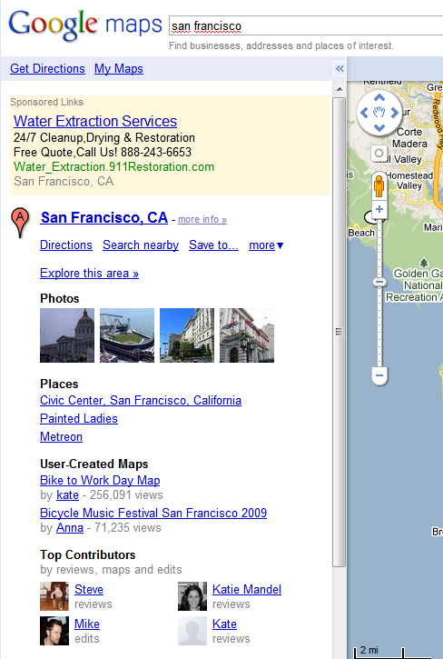
The same is true for Maps. In addition, three column design goes away, falling back to two columns — one on the left for listings and textual infomation, while the right column is for the map itself:
[ttjad keyword=”general”]

