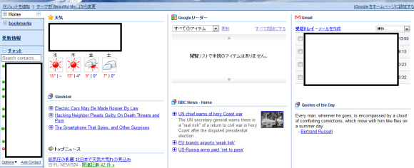
The search giant,Google is testing a new iGoogle homepage design amongst a limited users group.he redesign seems mostly cosmetic, but it has been a long time coming as the personalized homepage hasn’t gotten an update in the looks department for quite a lot of time, not accounting for the theme packs Google releases from time to time.Testing has been done amongst 23,000 people.
One of the changes in the upcoming redesign is the cleaner look of the gadgets. The individual gadgets are no longer so clearly separated. Currently, each gadget has its own rounder border which completely surrounds it.
But now, Google wants an updated homepage in order to deliver a more natural look in separated lines. More precisely, the gadget controls are now presented in a hidden form by default and would only start to appear when you hover over one. Apart from separated lines, each gadget would be represented by a small icon next to its name.
Again, this should make the site feel less like it’s been stitched together from different parts. Another change is that each gadget gets a small icon next to its name.
For now, the redesigned homepage is in testing with some users. Google generally live tests all of its new features and changes with a small subset of users.


