In some way, font is a very much important thing in digital printing media. Barcelona-based Birgit Palma has explored some fonts that can leave a superb impression to others regarding your font choice for your digital printing media.
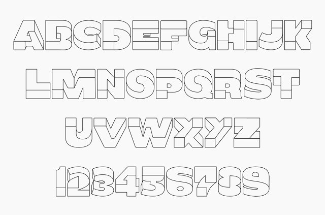
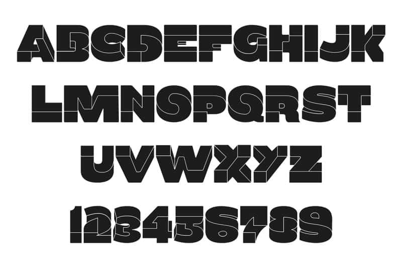
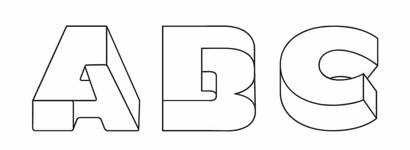
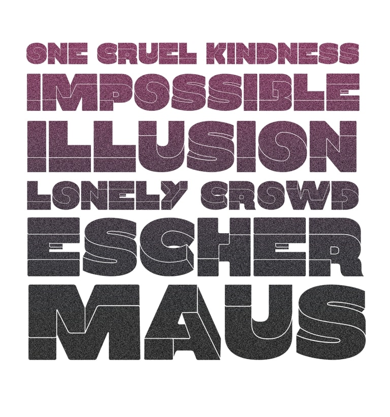
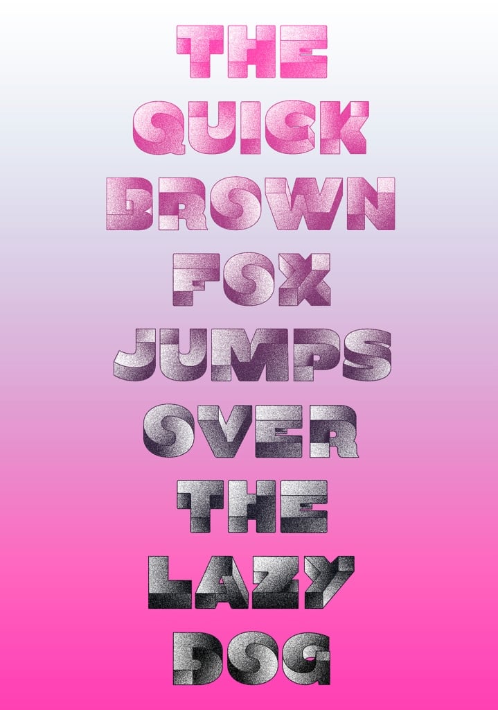
During his lifetime, famed graphic artist M.C. Escher explored the concepts of mathematical infinity and impossible geometry in a series of wood prints, lithographs, and mezzotints. But Illustrator, Multimedia designer & Art director Birgit Palma has designed some fonts called the Oxymora. The very interesting thing about these fonts is that the longer you look at them, the more your mind lurches as you try to wrap your head around what you’re seeing. Here are some images of Oxymora typed fonts.
Regarding these Oxymora, Palma has mentioned, “I did some work for a client and started to play around with Escher’s impossible shapes. In the end I got so addicted by the system that I made a complete font, based on impossible shapes.”
Note that every typeface is really just as much a collection of geometry as it is a collection of characters. On the other hand, what makes Oxymora different from other typefaces is that the geometric configurations make no sense. Instead, they are optical illusions, an alphanumeric family of blivets, veeblefetzers, and Penrose Triangles.
However, Oxymora will soon be published as a display font by Ultratypes. It’s probably not the best font choice for your average document, but if you’re looking to leave an impression, Oxymora will do the trick.
Sources: Cargo Collective, Inspiration Hut
Thanks To: Fast Co Design
[ttjad keyword=”laptop-hp”]






![Read more about the article How Facebook Smart Ads Violating Privacy [Comedy Video]](https://thetechjournal.com/wp-content/uploads/2011/11/FB-Smart-Ads-Comedy-3-512x254.jpg)

Did you remember your thickness is wired to return to CBD? Every hominid has an endocannabinoid system (ECS) that influences atmosphere, slumber, and invulnerable response. CBD is unequalled because it doesn’t cement precisely to receptors like THC does; as an alternative, it encourages the body to use its own endocannabinoids more effectively. It’s like a tune-up in compensation your biological signaling, promoting expertness and manoeuvre