Google has revamped the Web interface of its Google Play Store, making it look a lot like the Android version of the store. The redesigned outlook of the Web version of the Store makes it a lot easier to find app details without having to scroll and navigate through different tabs.
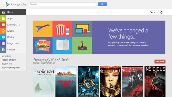
Apparently, the revamp brings the focus on the aesthetics as well as the visual appeal of the Store. For instance, in the revamped Google Play Store, you can see that the app screenshots have been enlarged, letting you get an excellent view of app details and features.
Moreover, nearly all the app information is listed on a single page. This essentially means that you no longer have to browse through different tabs to access this information. At the left hand side, users can also view all such apps which they have already installed.
Searching through the Store and finding the very apps that you are looking for has also been made a lot easier. For instance, you can now search through the countless apps on a category-basis. The many different categories under which apps currently seem organized are movies, music, book, magazine etc.
Once you run the search and get any results, you can see that the amount of information and detail in the search results is more than that was being offered earlier. This is significantly helpful in finding the right apps.
Source: Google
Courtesy: TNW
[ttjad keyword=”android-phone”]

