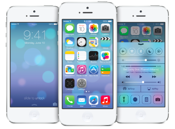
For long, users have pined for Apple to visually update its mobile operating system, the iOS. Apple has finally heeded these demands, unveiling a major design overhaul in iOS 7 at WWDC 2013. With these changes, iOS 7 appears far more clean, easy-on-the-eyes and visually appealing.
One of the key changes that Apple has made in iOS 7 is tweaking the apps. Until now, we’ve seen most iPhone apps being a tad bit cluttered. However, with the design overhaul, these apps come with a lot of white space and a slim black font, giving them a very clean and rather spacious look.
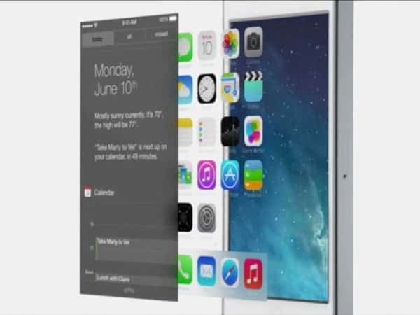
Calendar app
Apple has also improved its iOS apps in terms of functionality. For instance, the Calendar app for iOS can automatically incorporate your Facebook events now and once you add a location of any of your meeting on your Calendar, it automatically calculates the time it will take you to reach the venue.
Weather app
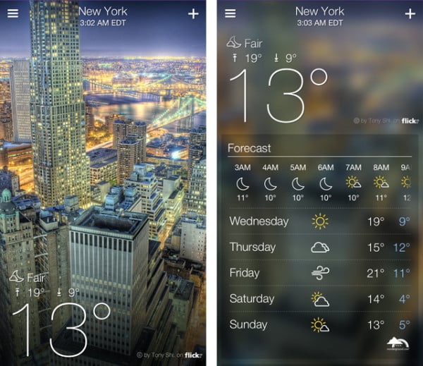
The other app that Apple has specifically curated to make it look and work better is the iOS weather app. For long, users have complained that the app falls short of many useful features and is rather underwhelming, compared to other weather apps in the market.
Addressing these issues, Apple has now packed the weather app with a very elegant skin and a very slim font. Moreover, Apple has also packed new animations in the app, which makes it appear incredibly sleek and visually attractive.
Mail app
Apple has also ramped up the Mail on iOS, giving it a new, clean look. The changes make Apple Mail look a lot more similar to the apps of Gmail and other notable email services.
With these changes, Apple has certainly enhanced the overall appeal of iOS 7 significantly. The design revamp makes iOS 7 far more user-friendly, brings many more features and gives it a much-needed face uplift.
[ttjad keyword=”iphone”]


