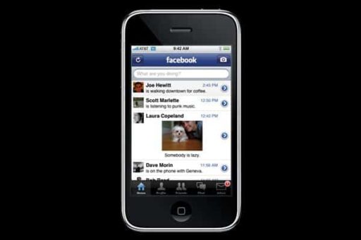
Facebook recently rolled out a major design update for its News Feed. The social network is now expanding the scope of this redesign to Pages, which look more ‘streamlined’ as part of the update.
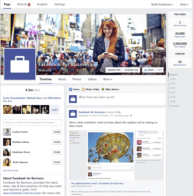
The redesign of the News Feed seems to indicate that the social network is moving towards organizing content better, keeping a focus on visual data and at the same time, maintaining an overall minimal outlook. So is the case with the new look of the News Feed, and Facebook has applied the same treatment to its Pages.
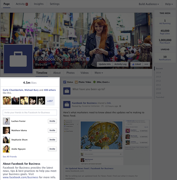
The new design of the Pages still maintains the general two-column layout. However, the content being displayed in these columns has been changed. The right column in the new design now displays the Timeline of the Page while the left column displays information about the Page.
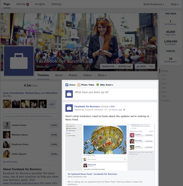
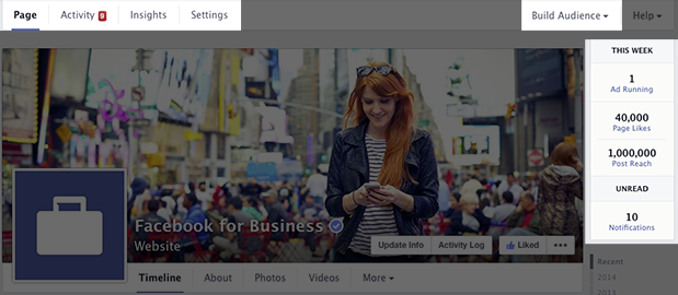
In another minor change which will surely be a relief to many users, the slightly annoying ‘Invite Your Friends’ section plastered over the right side of the Page has been rehashed and moved to the left, so that it looks more in sync with the general flow. Another excellent new feature in the redesign is a small column inserted at the top right corner of the Page. This column displays the number of Likes, post reach and the number of ads running and is visible to Page admins.
In all, the new design does seem neater and more organized than the last look of the Pages section. It remains to be seen how Page admins and Facebook marketers take this change.
Check new menu for admins
Source: Facebook
[ttjad keyword=”kindle”]

