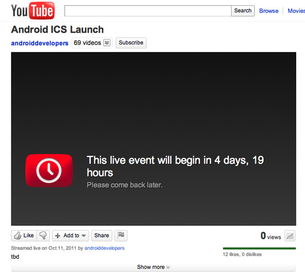
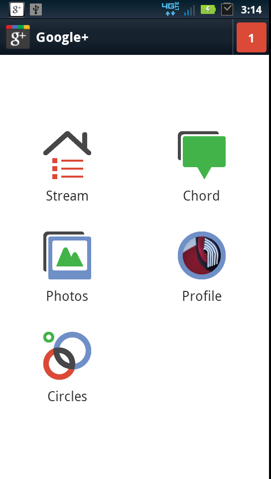
The Youtube account that will be streaming the upcoming Samsung/Google event on October 12th has accidentally slipped with posting the stream already and the title confirms that Ice Cream Sandwich launches October 12th.A funny thing happened to the folks at Android Police, the same group responsible for leaking some of the first screenshots of Ice Cream Sandwich and they’ve since come across a few apps from Google’s upcoming release. The Google Plus app found on the Verizon Ice Cream Sandwich device, which marked as v2.0 and contains numerous UI changes from the v1.0.x that is in the Market right now…………….
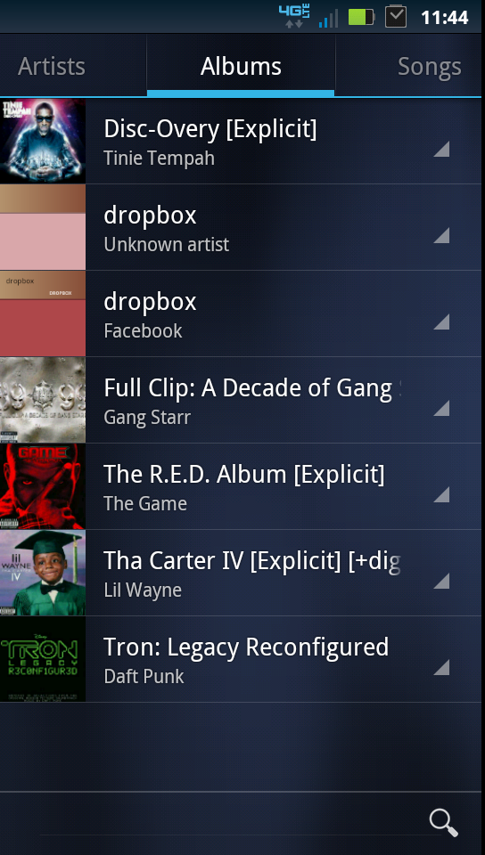
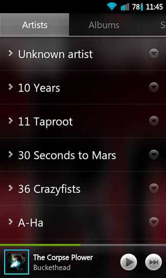
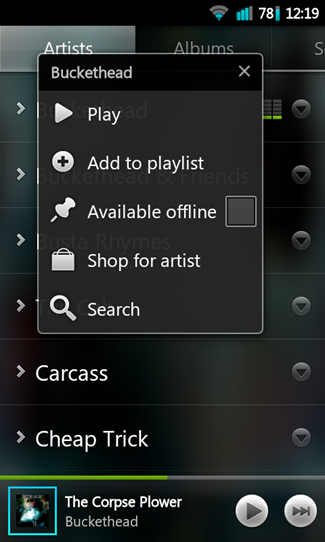
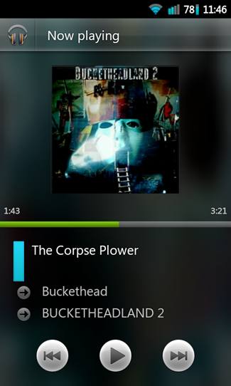
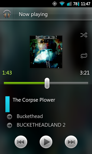
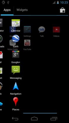
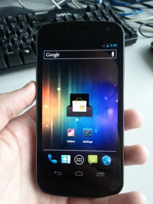
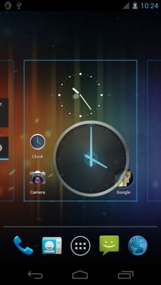
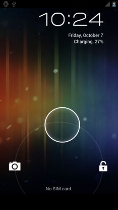
The Android Developer YouTube channel (which serves as the official video repository for Google’s Android Dev group) put up a placeholder page for the livestream of the October 11th event. Between Ice Cream Sandwich and the unveiling of the Galaxy Nexus (the device formerly known as the Nexus Prime), this event is absolutely shaping up to be one to watch. An all-new video has popped up on the internet, which apparently shows the Google Nexus Prime with Android Ice Cream Sandwich running on top and the blurry video shows what is claimed to be the Google Nexus Prime being put through its paces. It looks like the real thing to us, as the phone’s design matches with the phone teased in Samsung’s Something BIG Is Coming video. Ice Cream Sandwich (ICS) on this device looks quite delicious with all its eye-candy: the animations and transitions are a sight to behold. It also looks similar to how ICS looked like on the recently leaked video of Nexus S running Android 4.0. A number of images showing the basic aesthetics of Ice Cream Sandwich appear to confirm the influence of Honeycomb‘s navigation and layout and starting with the unlock screen, it’s obvious that this version of Android is not going to be a minor upgrade. The chaps at Android Police have stumbled upon Google+ 2.0 and Music 4.0 apps that support the Ice Cream Sandwich experience. Each title has its own set of changes, some of which may go unnoticed by casual users. Hard-core Android enthusiasts will recognize that the Music app shows a much cleaner experience with modified options and controls, less obtrusive buttons and the ability to rate music with a thumbs up or thumbs down. Presumably this last item will tie into the Google Music cloud experience that learns your preferences and queues up more of what you want to hear and less of the other stuff.
ScreenShots:
[ttjad keyword=”android-phone”]

