When back a few months ago Antoine Leblond and Ted Dworkin announced that Windows 8 will be starting to work on their very own Windows 8 app store, everybody was more than excited, but as it turns out the endeavor wasn’t so smooth as some might have expected.
“In designing the Windows Store, we’ve tried to strike a balance between a design optimized for serendipitous app discovery through curated content, and one where customers can easily find the apps that they search for directly,” program manager of the company’s Store client, Jonathan Wang said.
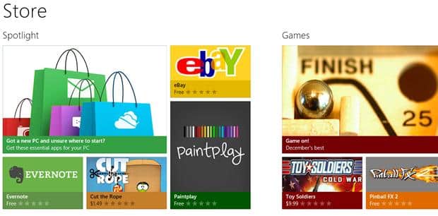
Back in December, the company was aiming to create Metro-style apps that were easily accessible and user friendly. Some prices were also announced. Costumers thus found out that they could be paying for an app between between $1.49 and $999. But before thinking of revenues, Microsoft had to design the landing page where all the list of apps under different categories will go on display. And it did. Now when accessing the main page, users can intuitively browse the store by content and category. Even your 6 year old cousin can do it.
To search for a particular app just tap the search button of course. Also you get the option of arranging the results of the search by price, release date and even user rating.


