Facebook has been redesigned a few days ago. You already have been noticed it. Facebook has been celebrating its 6th anniversary with their new milestone for serving 400 million users across the world. Congratulations Mark & Facebook. Their redesign emphasizes on applications, games and search.
According to Inside Facebook, 80 million users got the new home page layout on February 4, and more will be seeing the redesign shortly. The new Facebook layout includes a new home page design, and an applications and games dashboard. You can even send messages without navigating away.
Links and items have moved around the home page as Facebook tries to streamline navigation and make games and apps stand out more.
The latest evolution continued Friday after Facebook started rolling the changes out late Thursday, the company’s sixth birthday. The changes were being made in stages, so not all users were seeing them right away.
Past changes have sparked protests from many users, though Facebook says it makes them to serve its audience better. Facebook says that it conducts months of testing and that many users request such changes.
With the latest redesign, links to friend requests, messages and comment notifications are no longer scattered around and now reside on the top of the page.
Under a new agreement, Microsoft will run text ads next to Facebook search results worldwide, rather than only in the U.S. as was the case before. However, Microsoft loses the right to sell display ads — the online billboards that command more money than search ads, but aren’t as lucrative yet. Facebook will now sell those ads directly.

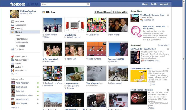
The pics show a much larger and more prominently placed search bar, which is just another example of how Facebook means business with search.
Facebook added real-time search features several months ago, and many of its recent privacy changes were made in the hopes that users would make some of their updates public so others could search for information just like they already do on Twitter and some other networks.
Many of the items (like groups and events) that were kept in the Applications menu in the bottom left have been moved back to the left sidebar on the main page. Rather than taking you to a new page, these now open within the main window where the feed usually appears.
A Facebook press release explained:
New Home Page Design
A simplified home page to provide easier access to what you’re looking for on Facebook. You can now quickly navigate to commonly-used areas of the site from the top and left hand menus. From the Top Menu, you can now easily find new messages, requests, and notifications using the icons in the top, left hand corner. The left hand menu is now where you can find all of your applications, previously located in the bottom dock. The links on the left will take you to your application dashboards. You can also find your Messages and Facebook Chat from the left hand menu.
Applications and Games Dashboards
The Applications Dashboard lets you view the latest applications you and your friends interacted with, as well as discover new applications based on what your friends are using. The Games Dashboard serves as a dedicated space for games on Facebook where you can interact with games you’ve recently played and discover new games based on what your friends are playing. On both the Applications and Games Dashboards, you can receive personalized updates to remind you of impending actions, sent directly from the applications.
Though you won’t see Friends lists in the screen shots, they still exist for the purposes of the privacy features for updates and profile info, and as sorting options for the news feed. The lists will expand if you click on “Friends.” Thanks to our readers for pointing this out.
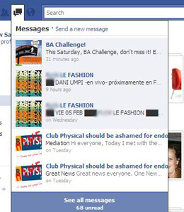
Instant messaging and the e-mail-like message inbox have been moved out of the periphery as well. Not only can you check your inbox from a dropdown menu at the top, you can send messages from there as well — again, all without leaving the front page. Your IM contact list is no longer hidden in a popup menu in the bottom right; it’s now in the left sidebar.
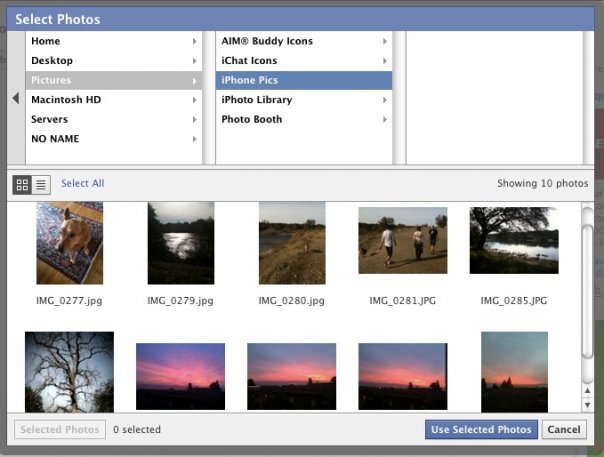
Unfortunately, the photo uploading experience hasn’t always been smooth; you’ve to wait for the photo uploads to finish, and the entire process was just sort of clunky. Yesterday, the company announced that it’s rolling out an improved photo upload browser plugin.
The new plugin includes a new photo navigator that should make it easy to choose the photos you want. And once you’ve started the upload process, you can browse to another page — the plugin will keep uploading the files in the background.
This plugin has actually been available for the last few months in Facebook’s Prototypes section, and has even been rolled out to a very small number of users before now. Starting today it’s getting released to everyone, though the rollout will take a few weeks. Before now Facebook has offered an upload plugin based on Active X and a Java applet, but the company says this one was built entirely in-house. One important thing to note: because this was built by Facebook, the company could potentially add more functionality in the future, including things that aren’t related to photo uploads.
Of course, there are plenty of other ways to upload photos to Facebook. The functionality has been integrated into iPhoto, you can download a Picasa Uploader, and there are plenty of unofficial apps available too.

Sources: msnbc, 901am, mashable, techcrunch


garage door spring repairs [url=https://otvetnow.ru]https://otvetnow.ru[/url] social media and search engine optimization