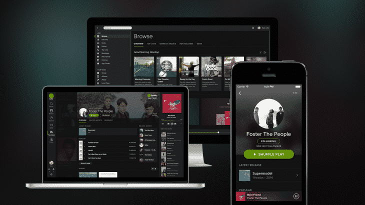
Spotify has featured a lighter theme ever since the service was launched. Now, it is finally undergoing a huge design transition, moving to a darker theme and better iconography.
So what exactly does the new theme offer? For a start, it is dark which means that album art and other information displayed on the screen are more vivid now. The service has also redone the fonts and adopted new iconography. This new iconography uses rounded shapes, much like we have seen at Medium.
Overall, the new look is certainly sleek and offers a better user experience. It will be made initially made available to desktop, web and iPhone users. Later, the company aims to roll out the update to all its users. The key changes in the overall look and feel of the Spotify include:
The theme: An executive at Spotify revealed that the aim behind the new darker theme was to make the on-screen content stand out with clarity, much like a movie in a cinema. The rounded iconography may be a part of this design philosophy.
Minimalist approach: According to the director of product at Spotify, Michelle Kadir, the design team took a very straight-forward approach to the update. The new theme was beta-tested with a number of users, across different countries and age groups.
Cross-platform consistency: With the race on for cross-platform compatibility of services, Spotify has taken the occasion to roll out a new, redesigned theme for all platforms. This means that the new Spotify will look the same across smartphones, tablets and PCs.
‘Your Music’ feature: This is a new feature which lets you organize your music with great ease. The company claims that it has attempted to make the whole process ‘frictionless’ for the users.
Courtesy: TNW
[ttjad keyword=”android-phone”]


